Table of Contents
Last updated Wed, Oct 07 04:22 AM PST.
See “Analyses” tab for past analyses performed.
Plot Explanation
Decision makers monitor new cases as they’re correlated with deaths 14 days later. Models often predict cumulative deaths, which I feel can hide the recent trends and make it harder to see how much cases are rising or falling. This site is created to show how new cases relates to deaths 14 days later and includes forecasts for deaths. The goal is for this to be a resource. As you see headlines reporting new cases, you can use these plots to put past trends in perspective with current and expected trends.
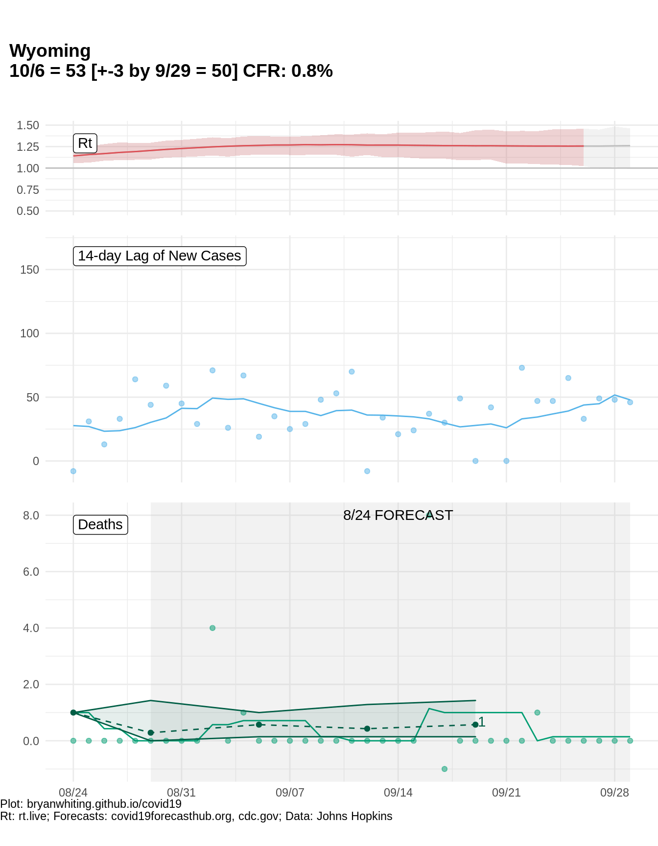
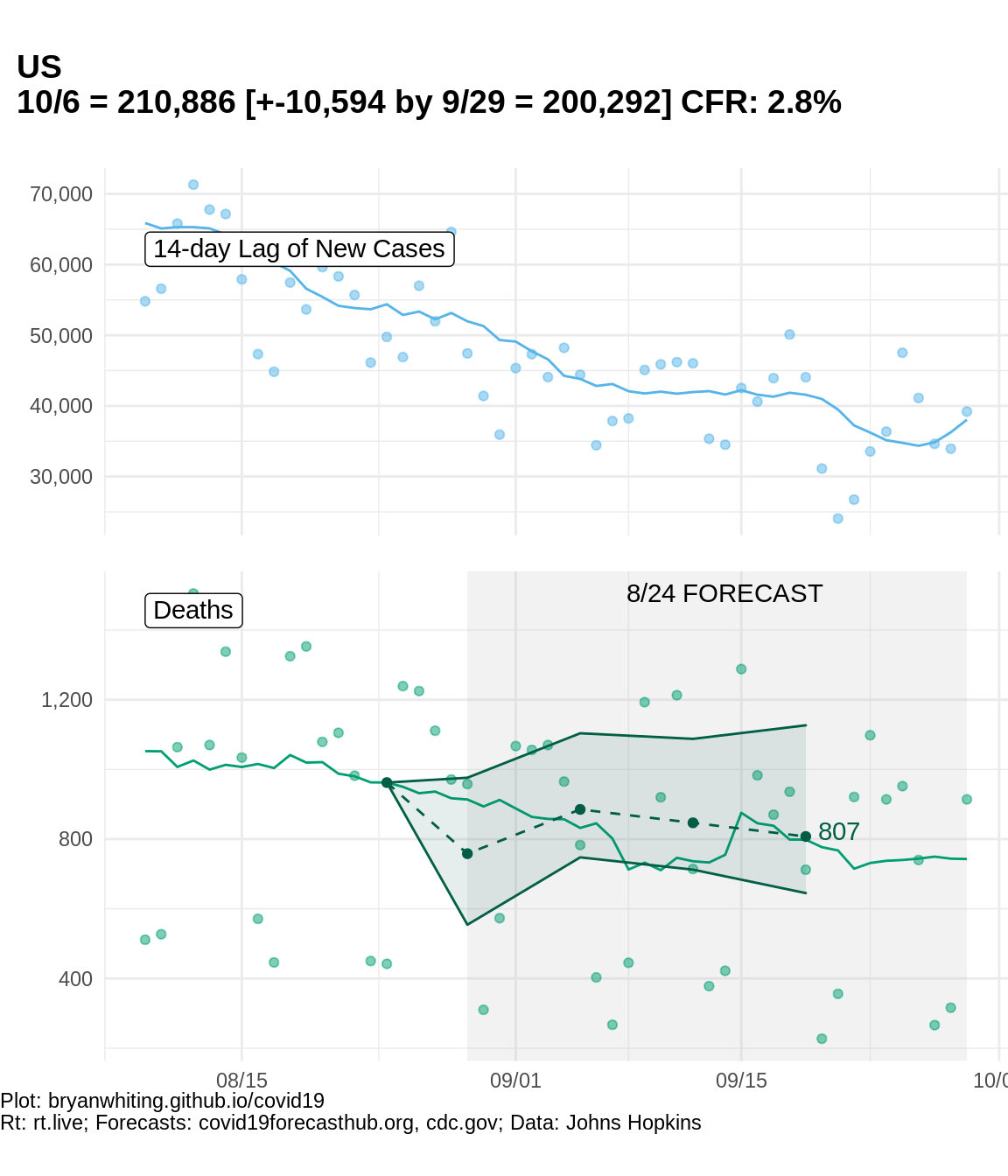
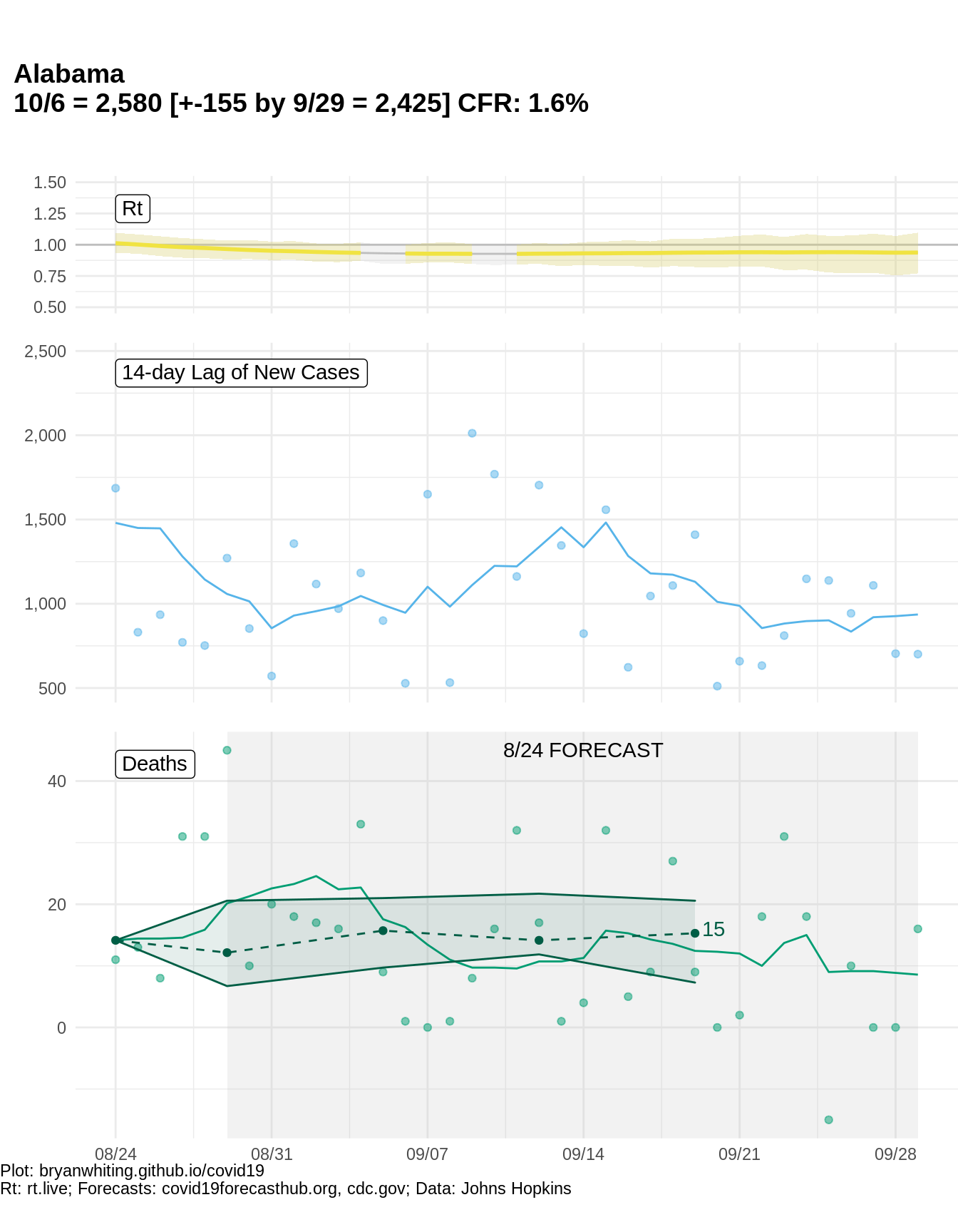
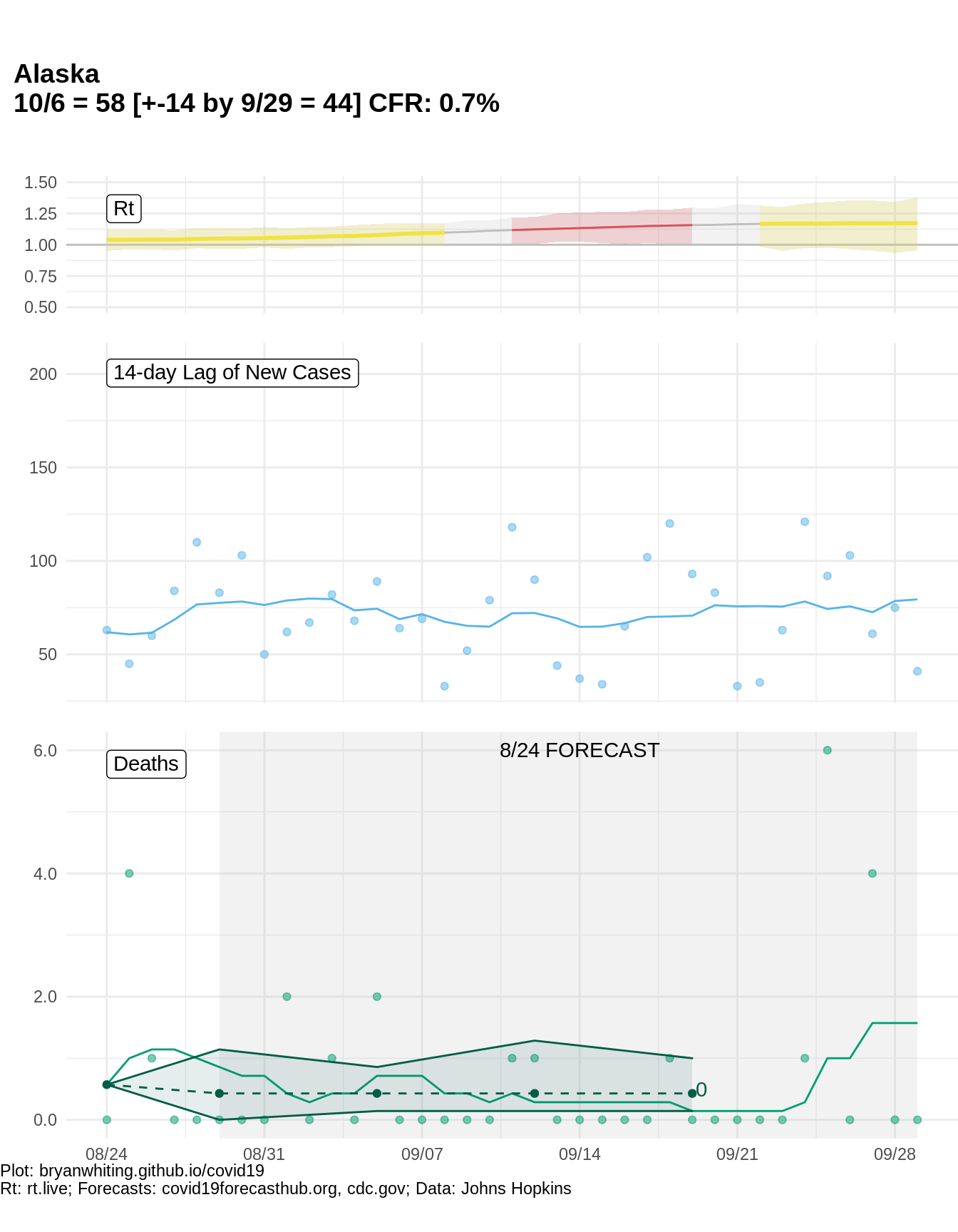
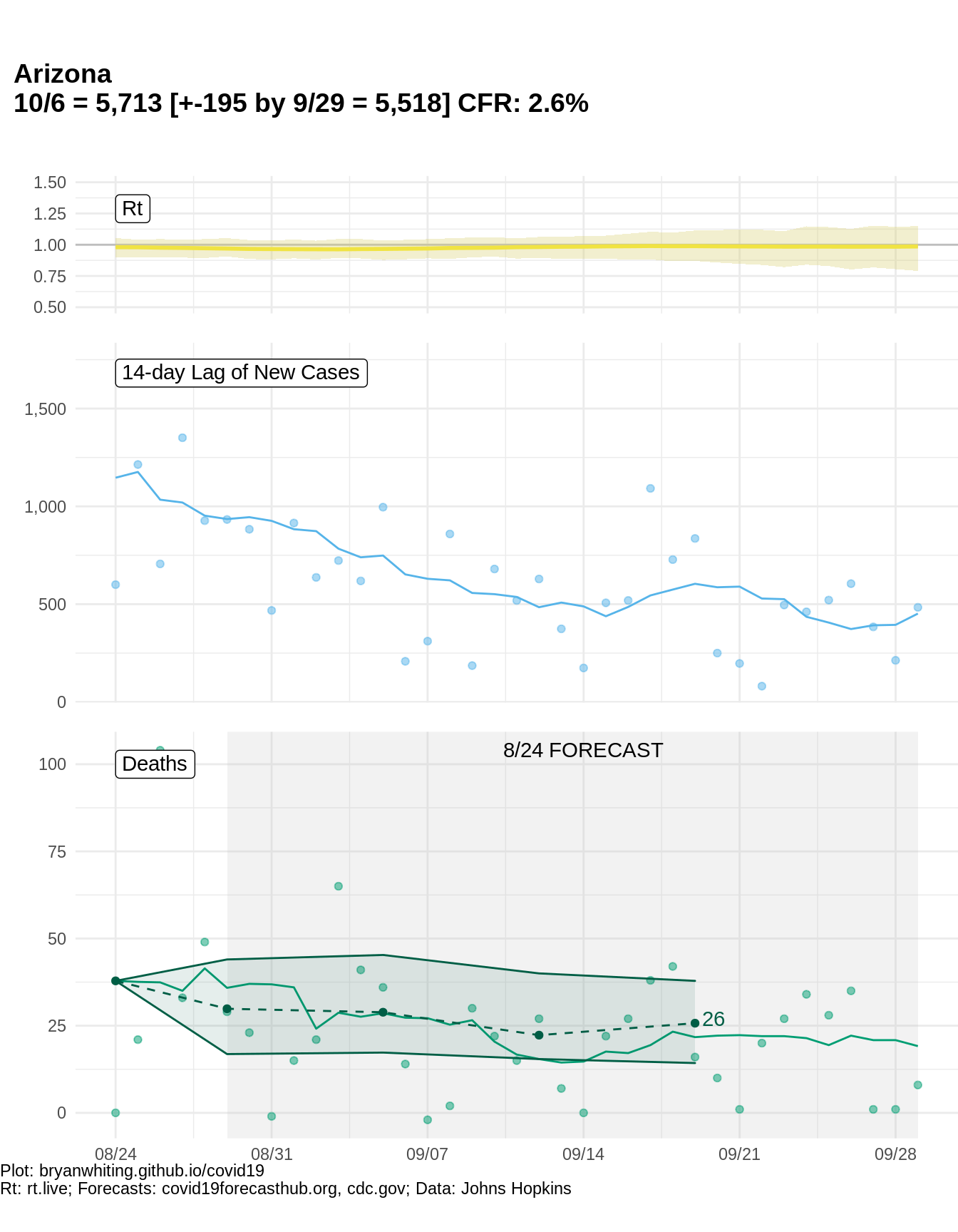
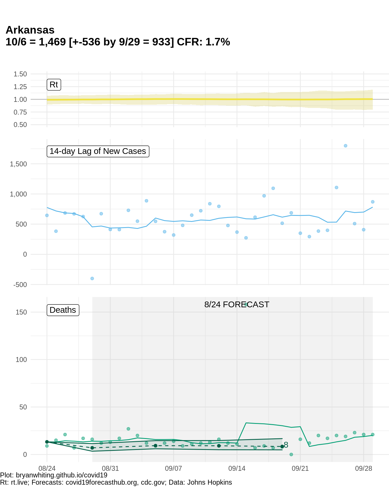
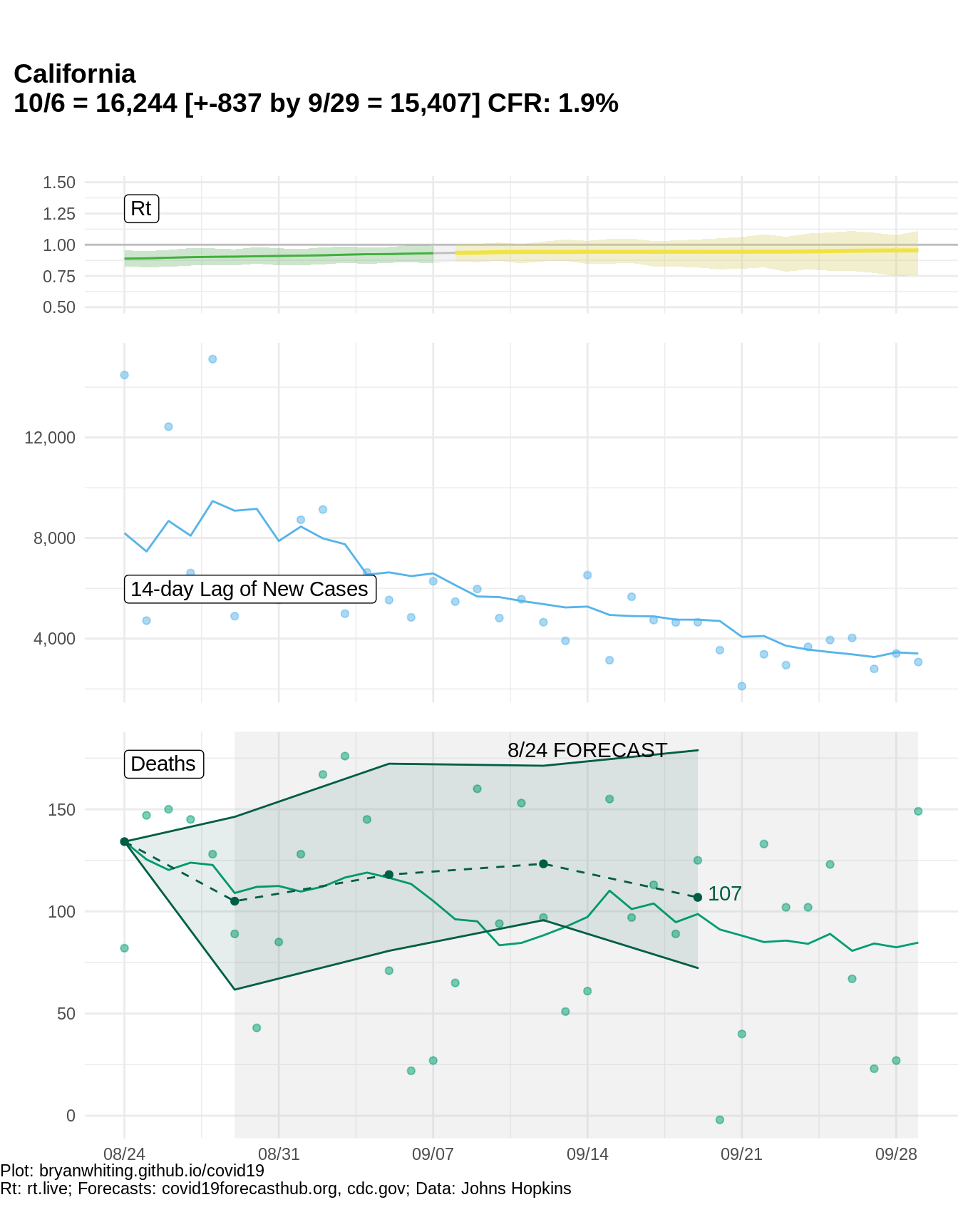
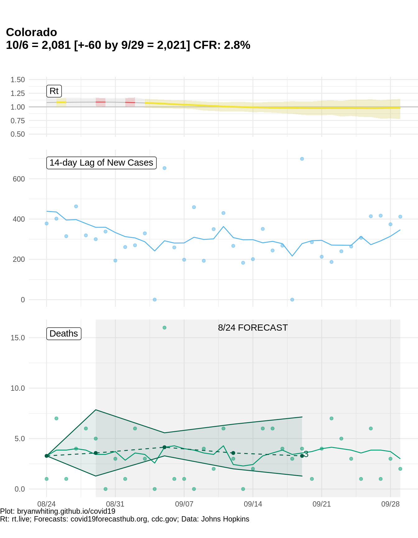
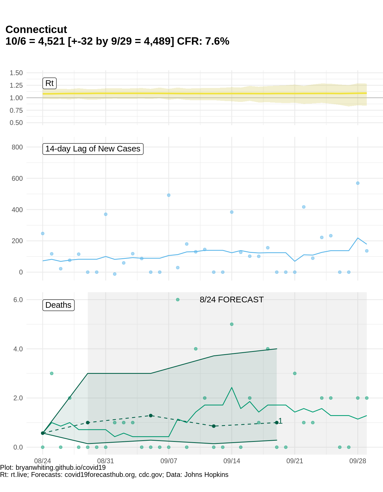
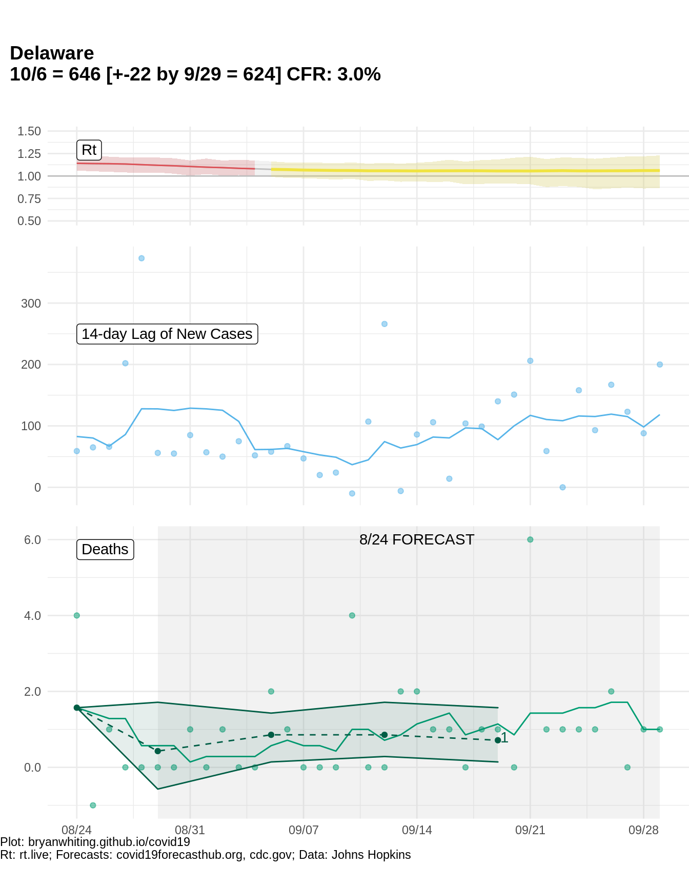
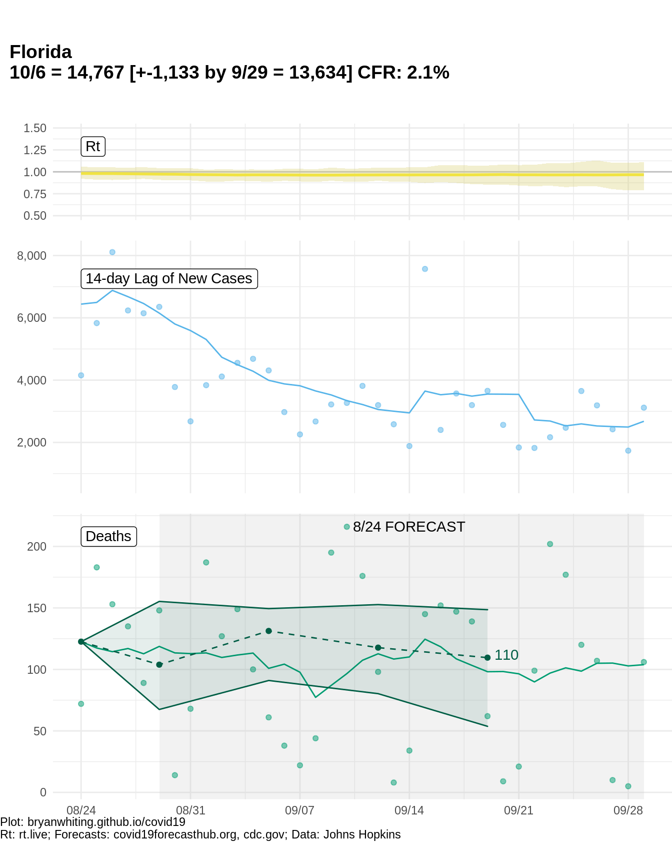
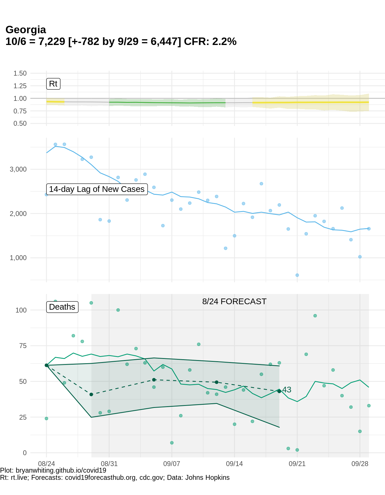
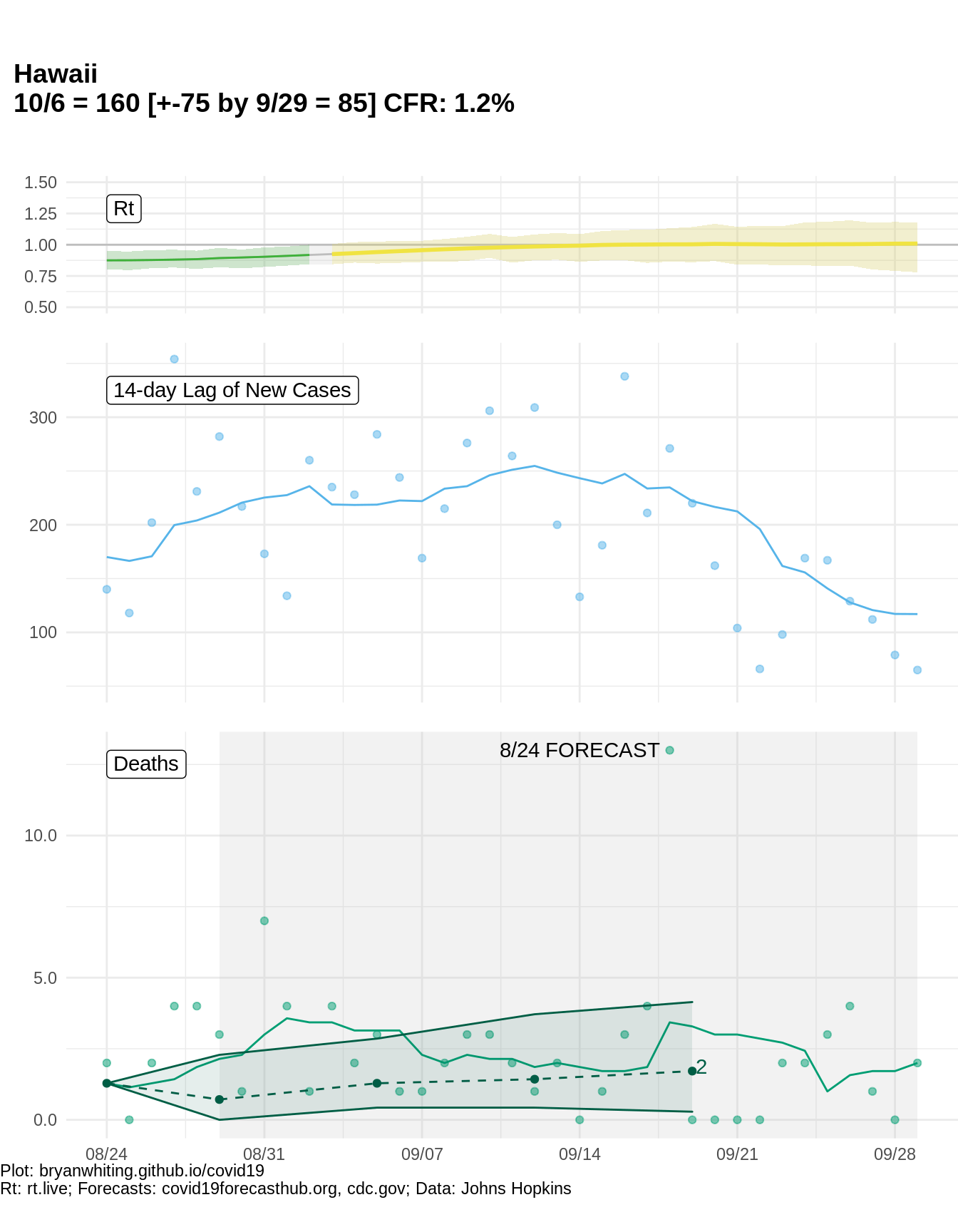
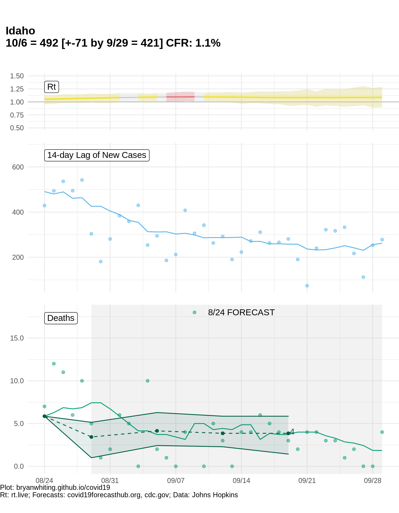
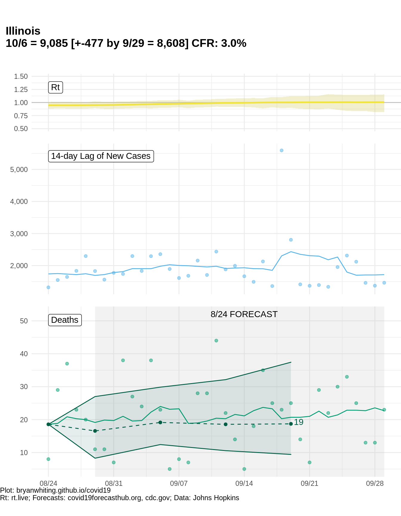
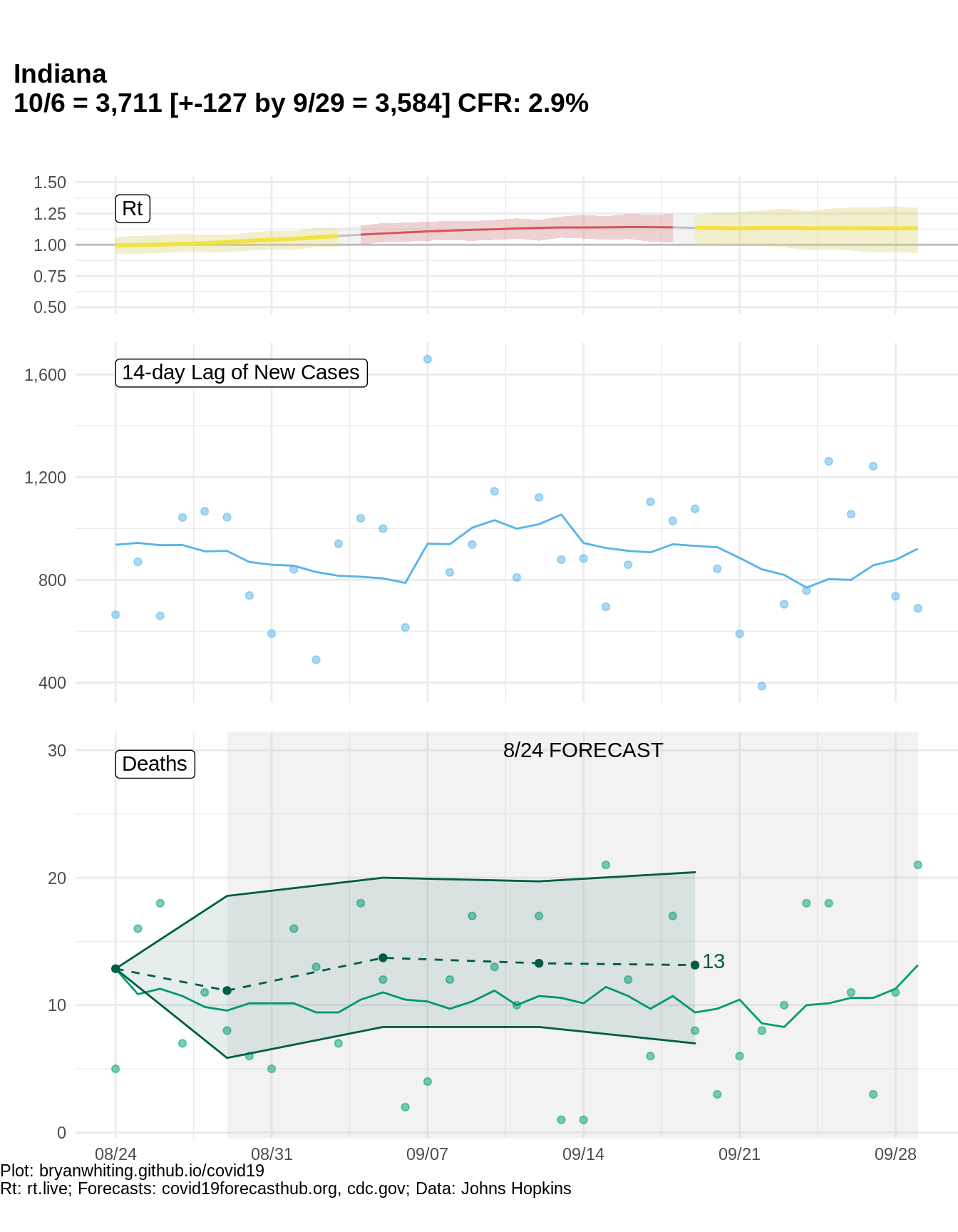
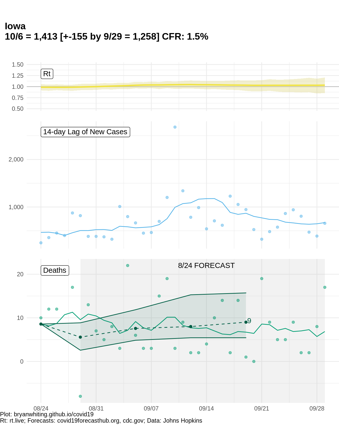
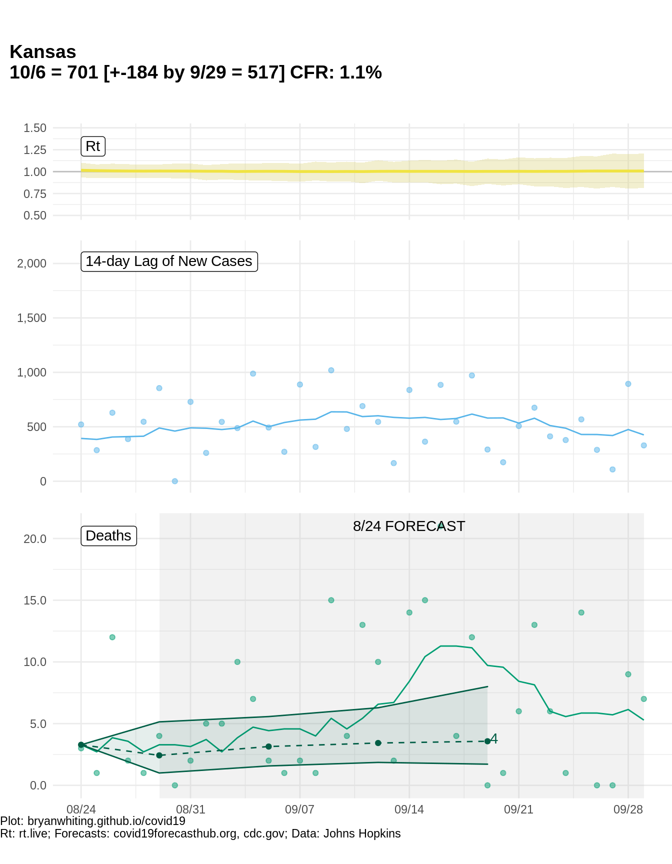
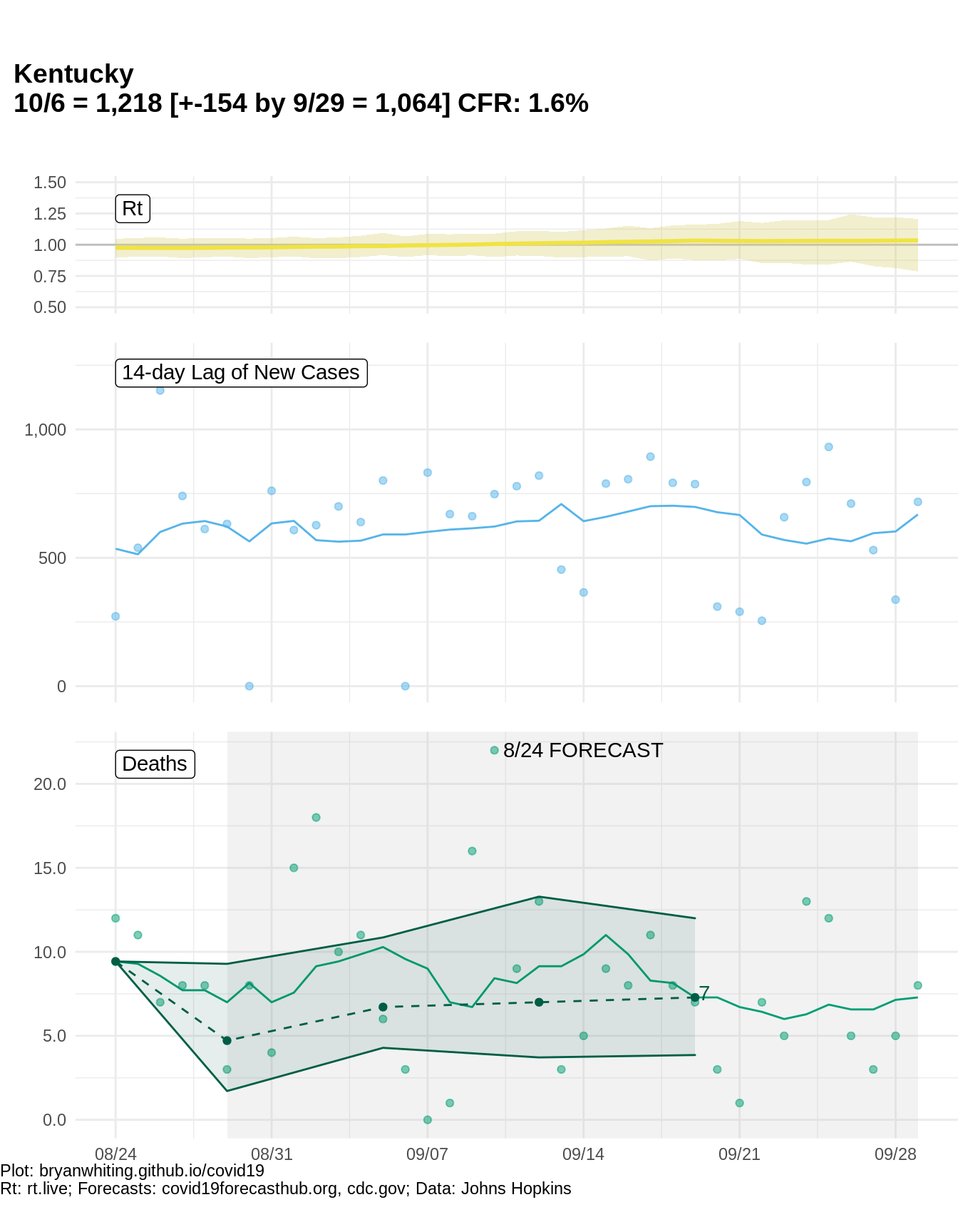
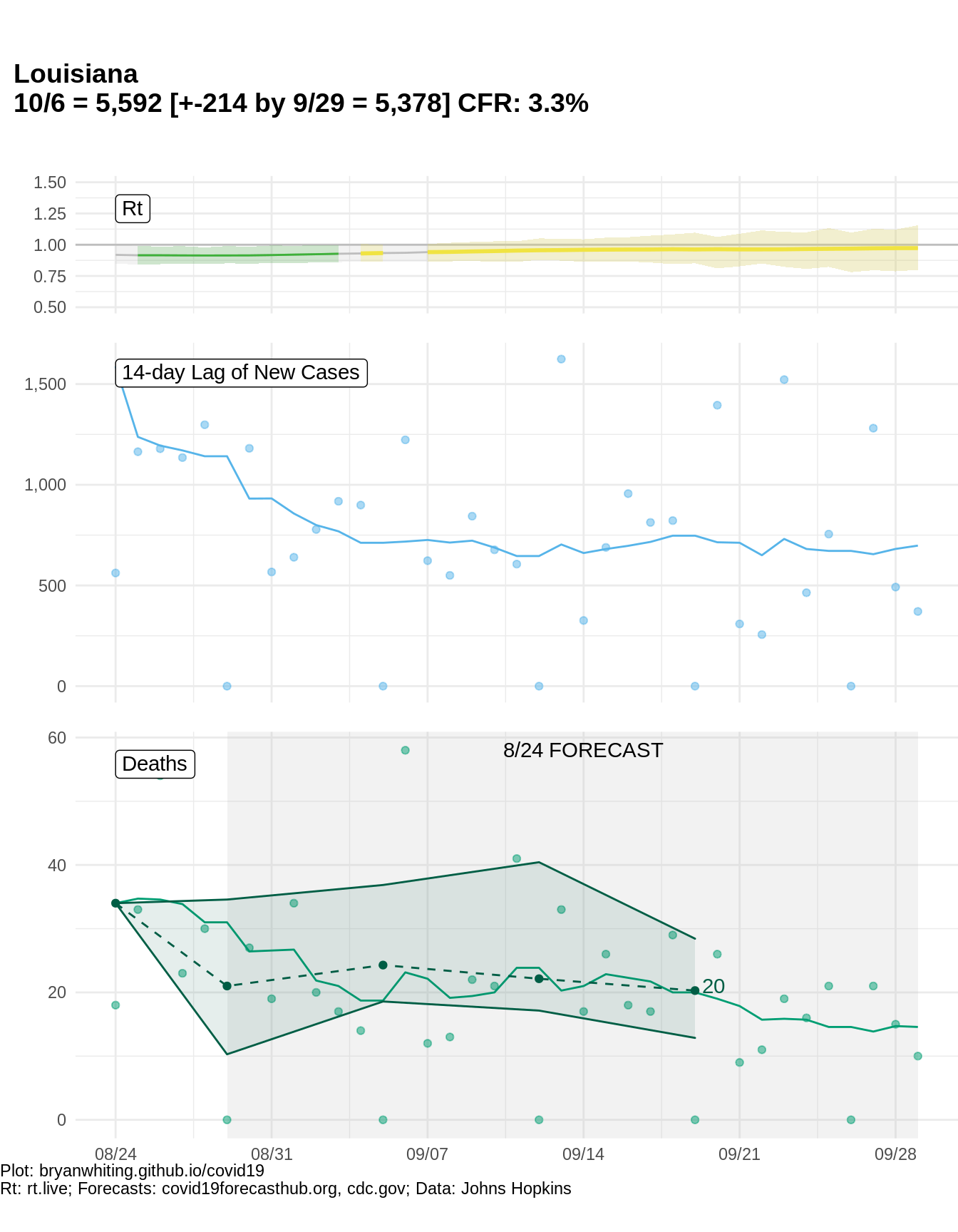
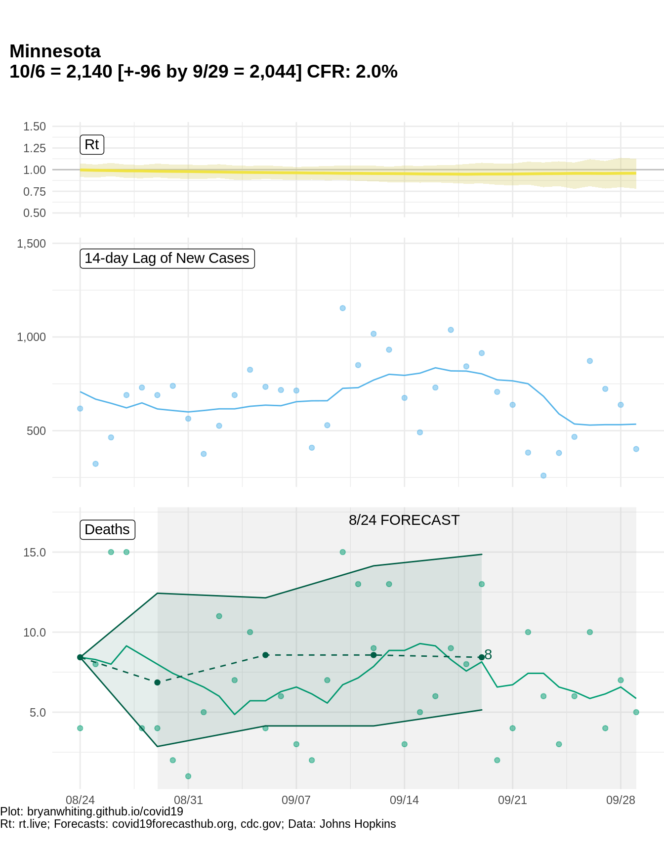
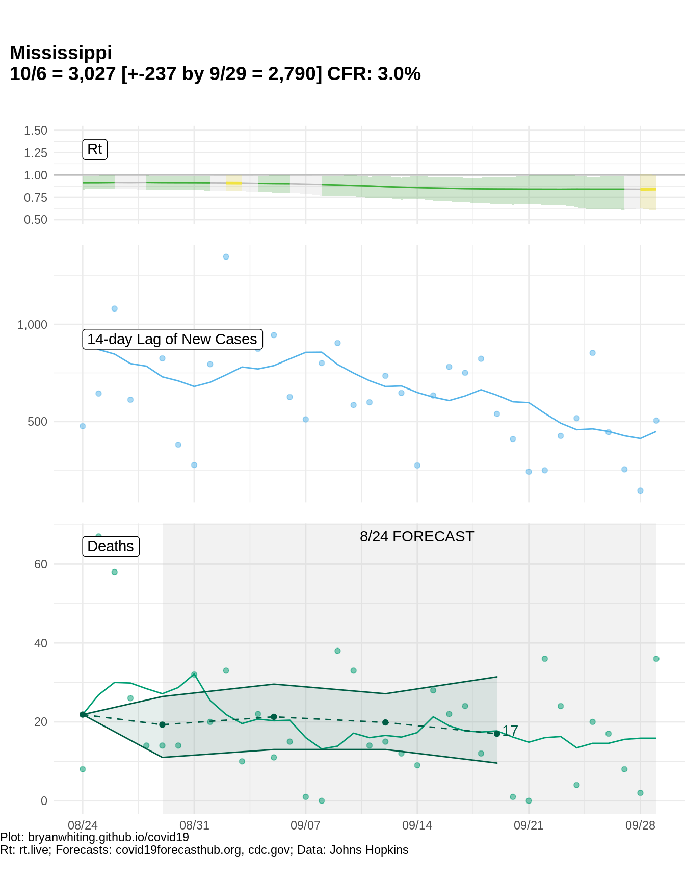
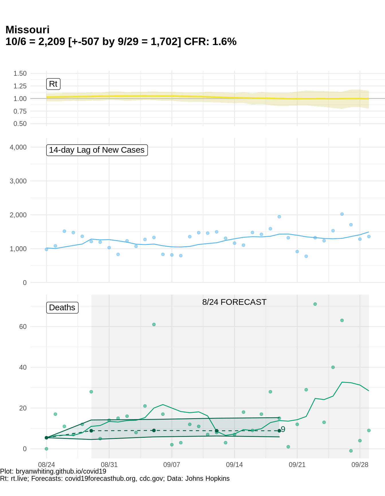
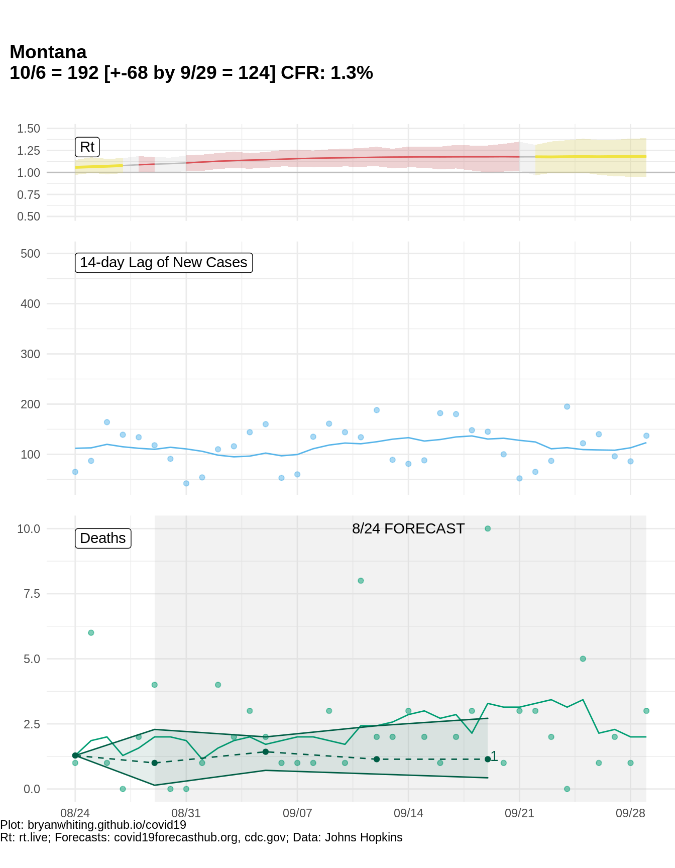
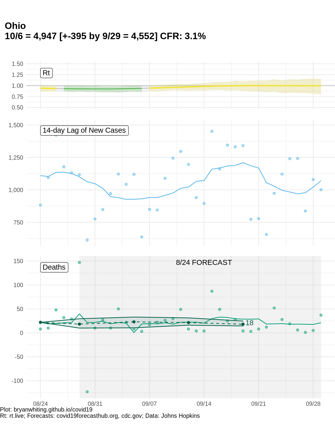
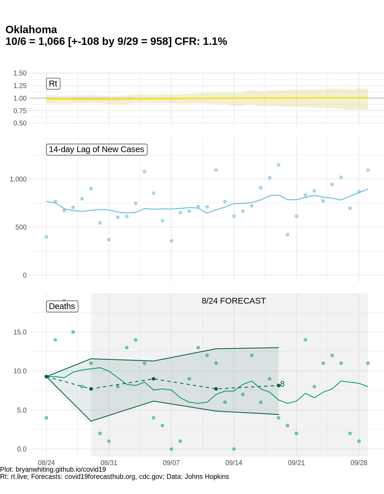
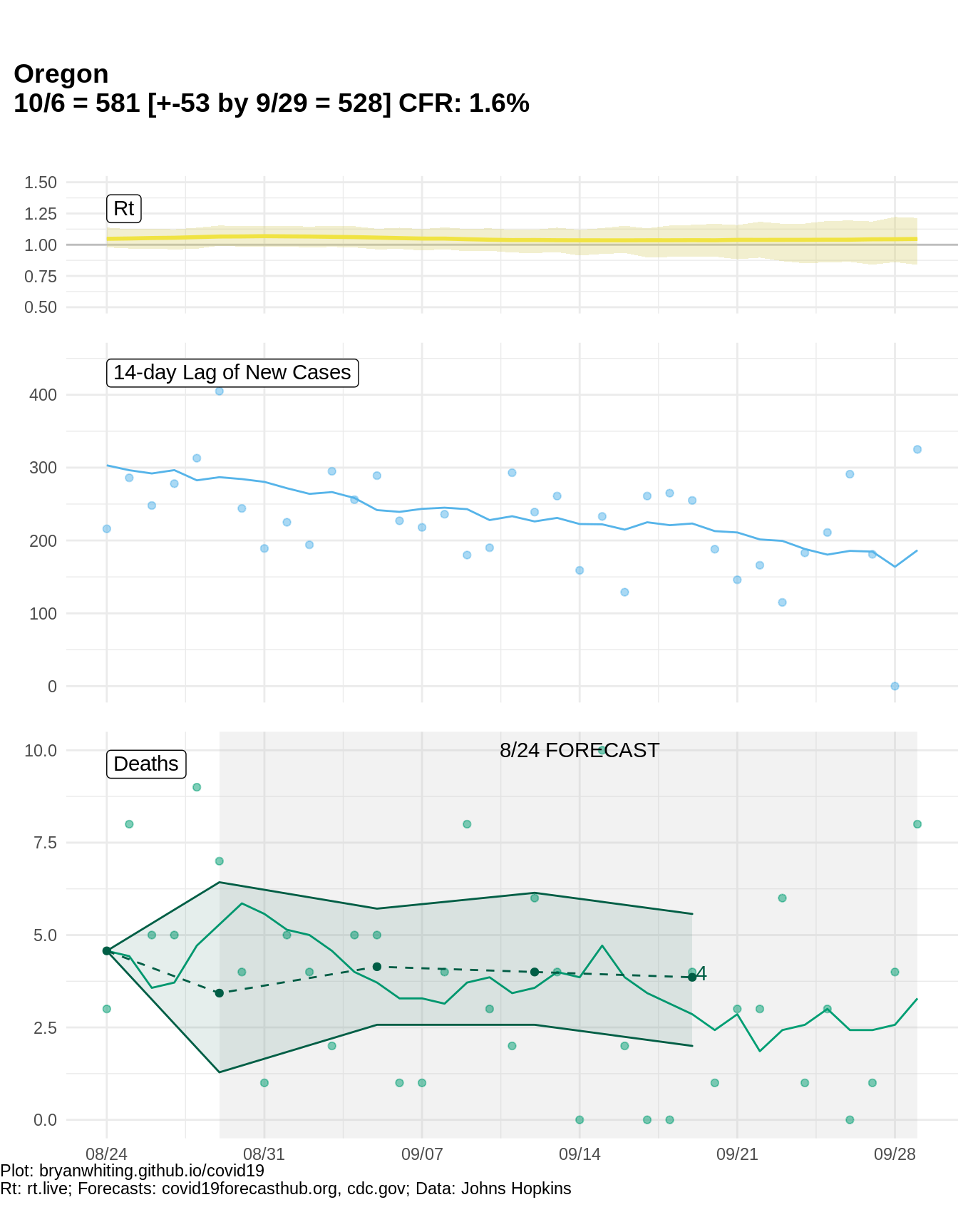
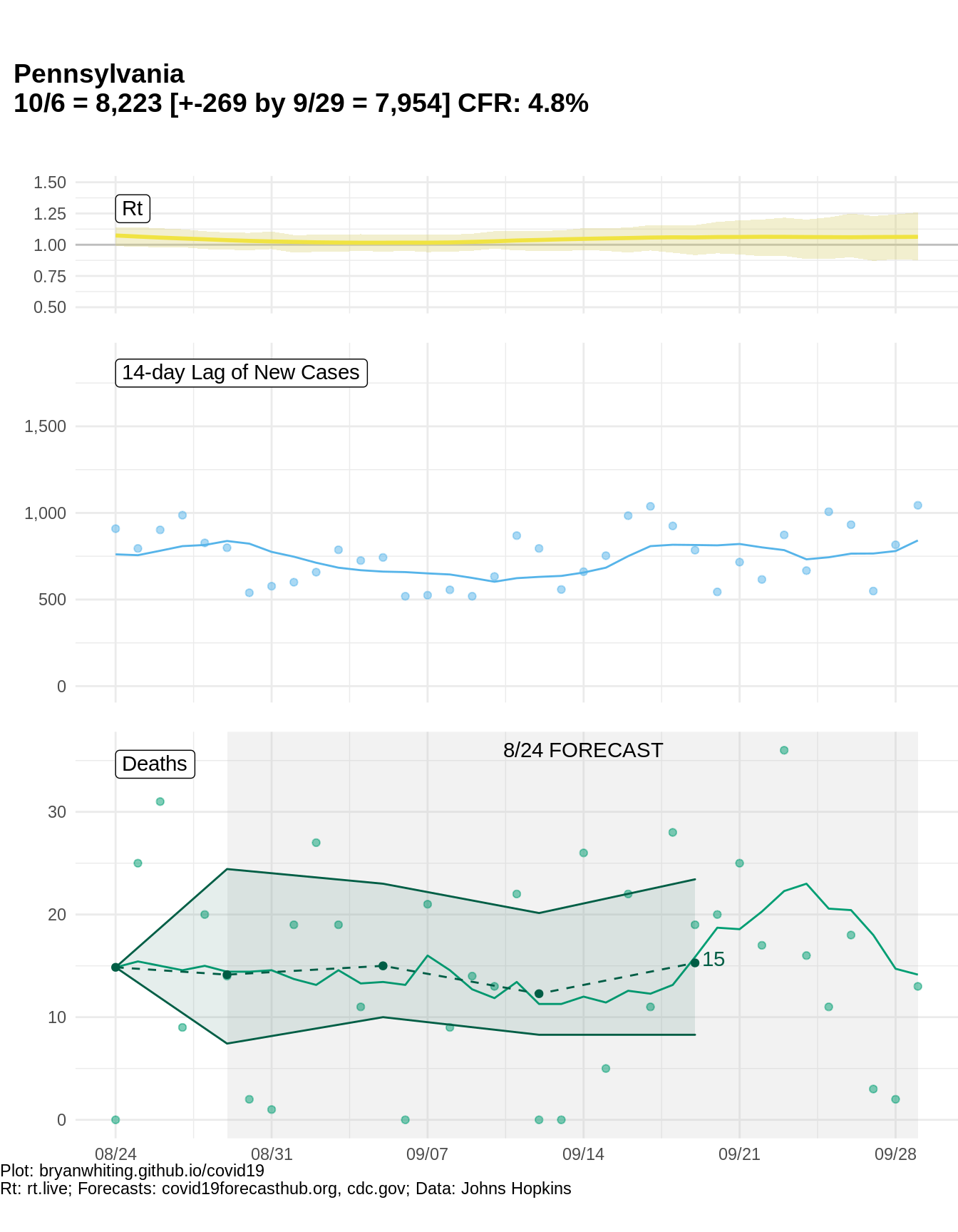
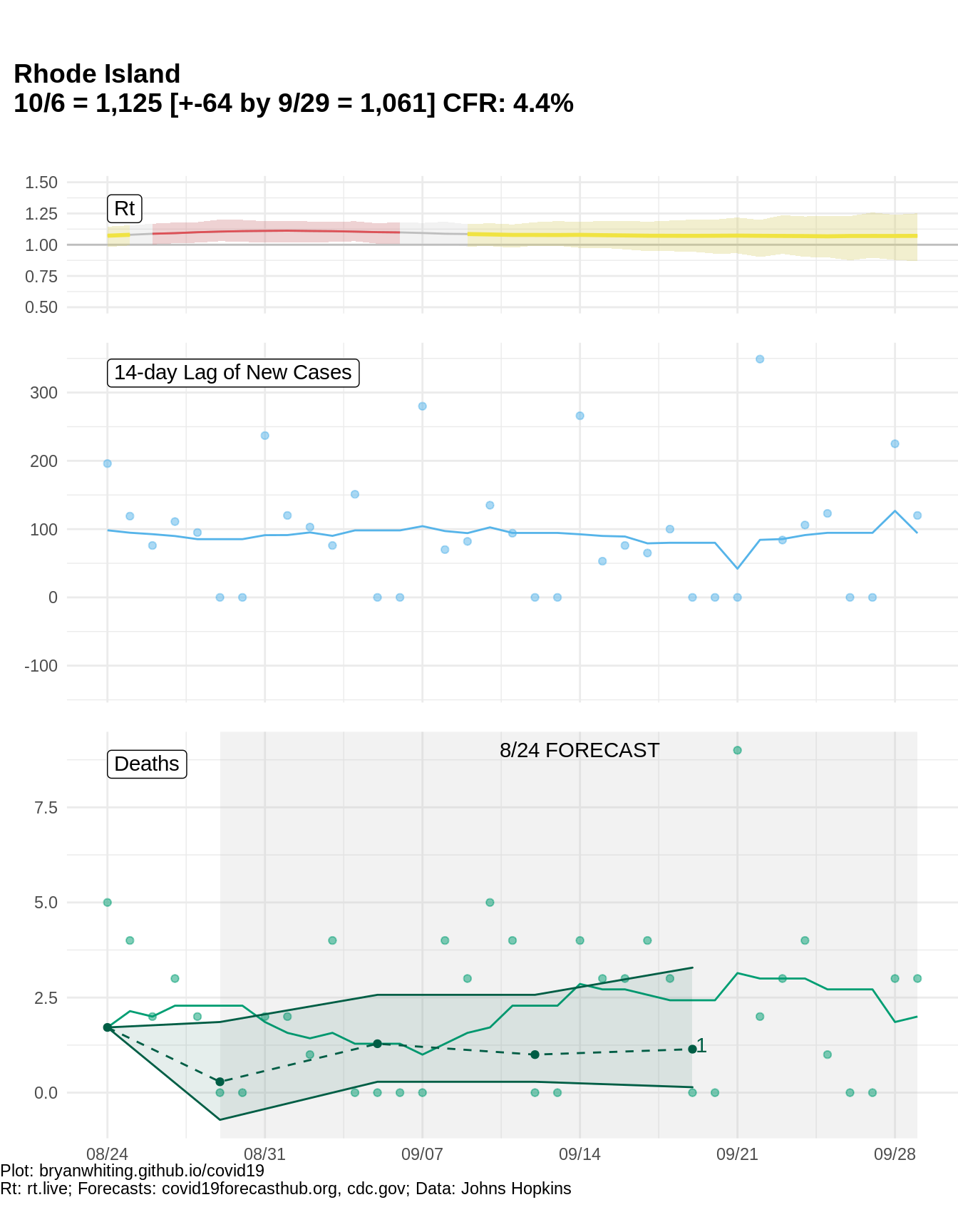
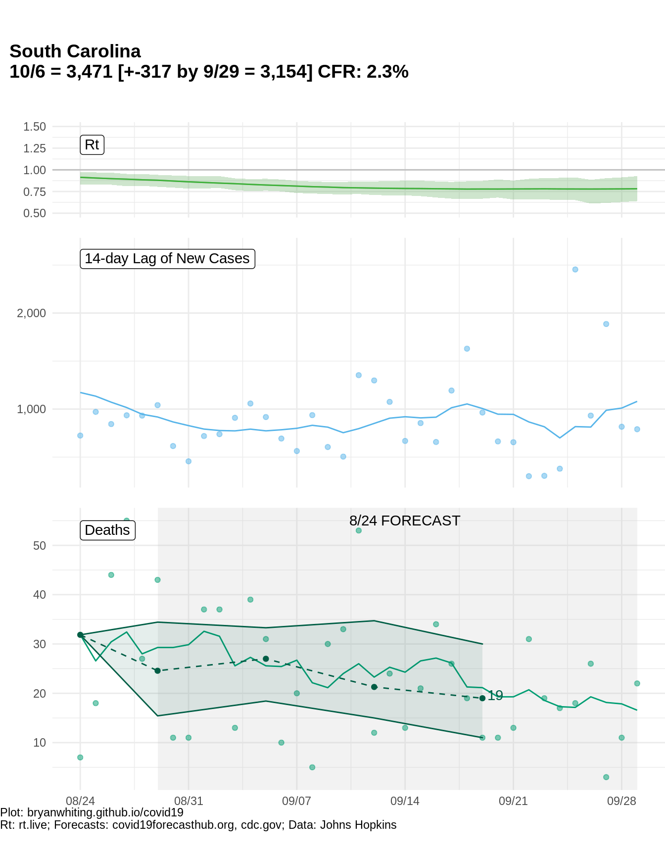
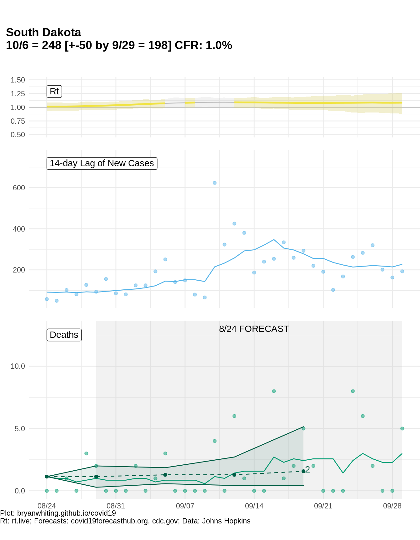
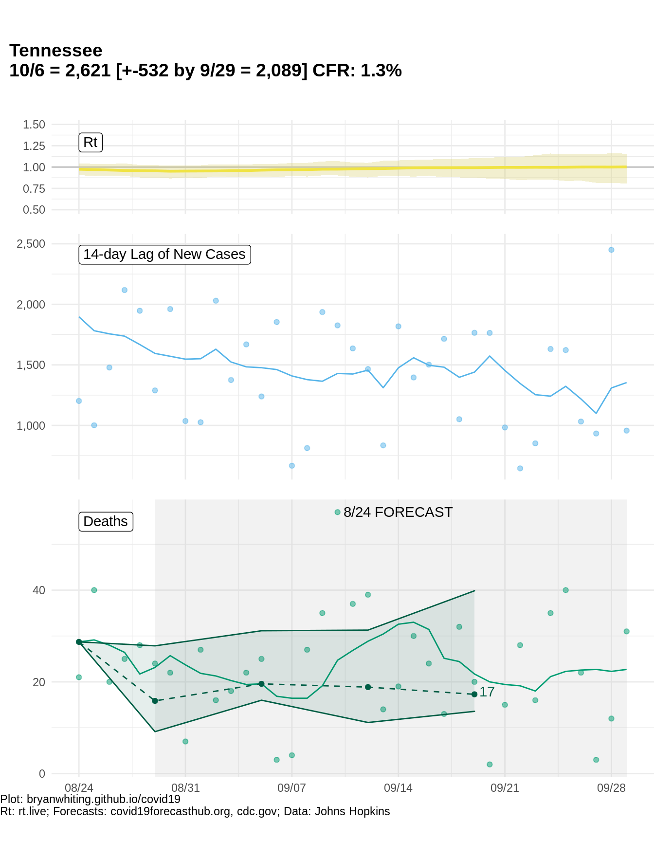
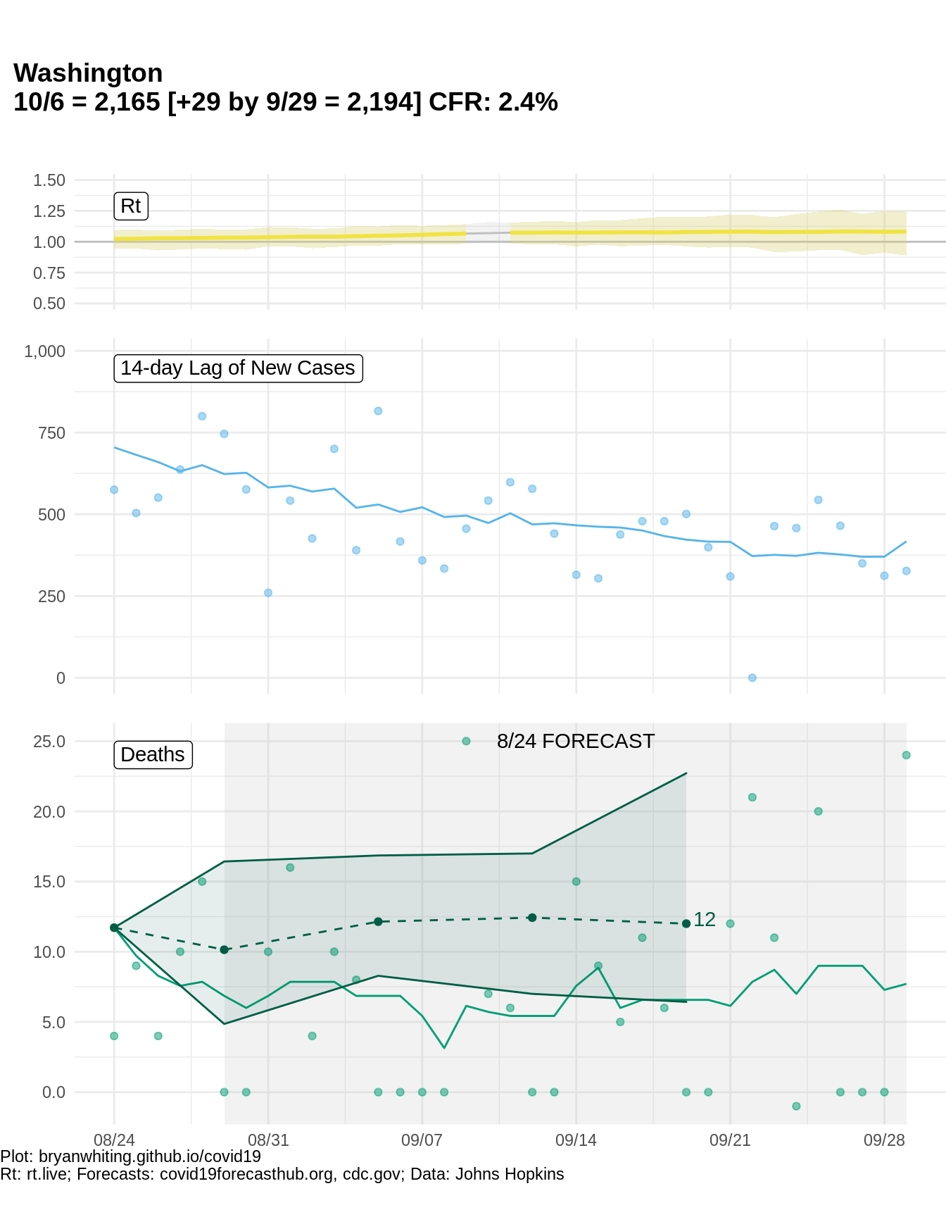
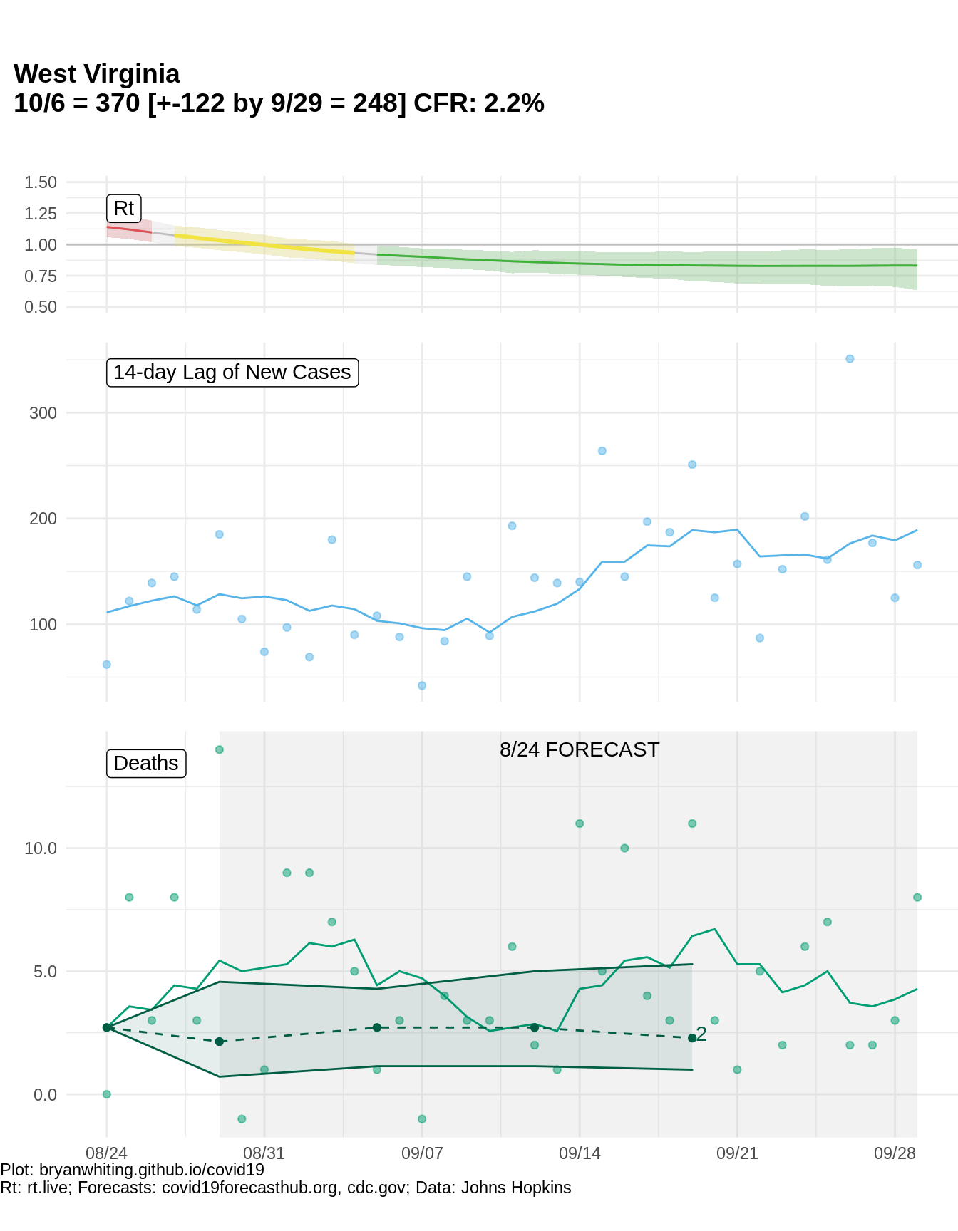
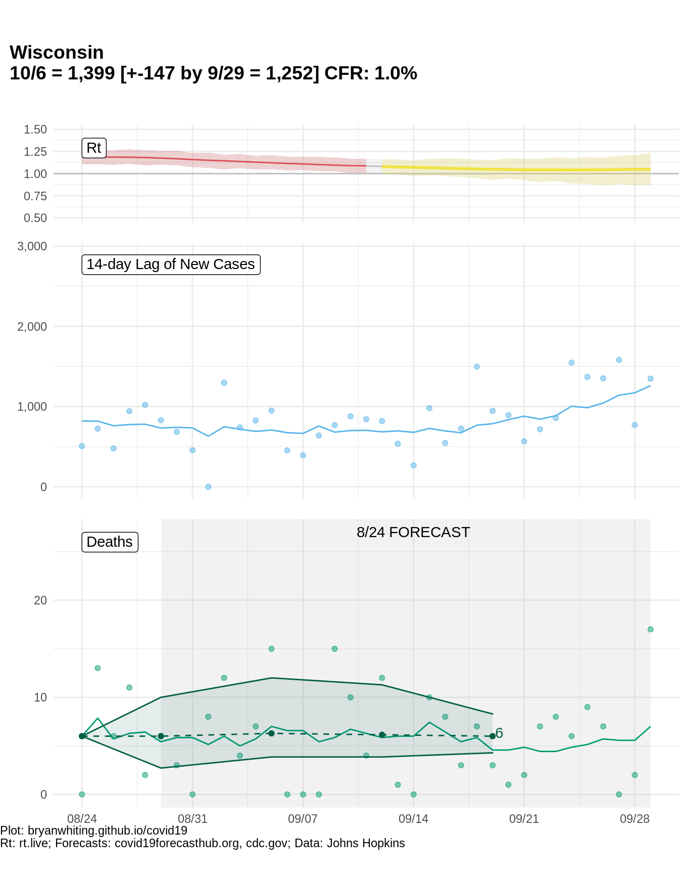
- Title: The chart title shows “current cumulative deaths and [predicted cumulative deaths over next 4 weeks]”. CFR is reported as
# Dead/# Confirmed. - Chart Points/Colors: Blue = 14-day lag of new cases. Light blue correpsonds to the green (present day deaths deaths). Dark blue is just the last 14 days of new cases and doesn’t have an associated green dot due to the lag shift. The dark blue can correspond to the dark green (predictions). This helps show how the current trends in new cases relate to the most recent predictions.
- Chart Lines: The lines represent a 7-day moving average. The dotted line represents forecasted trend.
- Forecasts: The shaded cone represents forecast uncertainty. The gray background shading represents forecast period. As time passes, some light-green dots appear in the forecast period which can help you assess the accuracy of predicted deaths as it relates to observed deaths.
Predictions were pulled from CDC.gov, which pulls them from CovidHub. The forecast model used is the “Ensemble” model, which averages across various models in a wisdom-of-the-crowd type prediction.
As predictions are reported in cumulative terms, I subtracted cumulative deaths as of the day of prediction and then divided weekly cumulative predictions by 7 to get a daily prediction. E.g., if cumulative predictions are 1000 on a forecast date of 6/1, and 6/8 predictions are 1200, the weekly prediction is 200 and the daily predictions are 200/7=28.5. I plot the daily prediction. Forecast points are on every Saturday. Forecasts happen weekly on Mondays.
US
States
Alabama
Alaska
Arizona
Arkansas
California
Colorado
Connecticut
Delaware
Florida
Georgia
Hawaii
Idaho
Illinois
Indiana
Iowa
Kansas
Kentucky
Louisiana
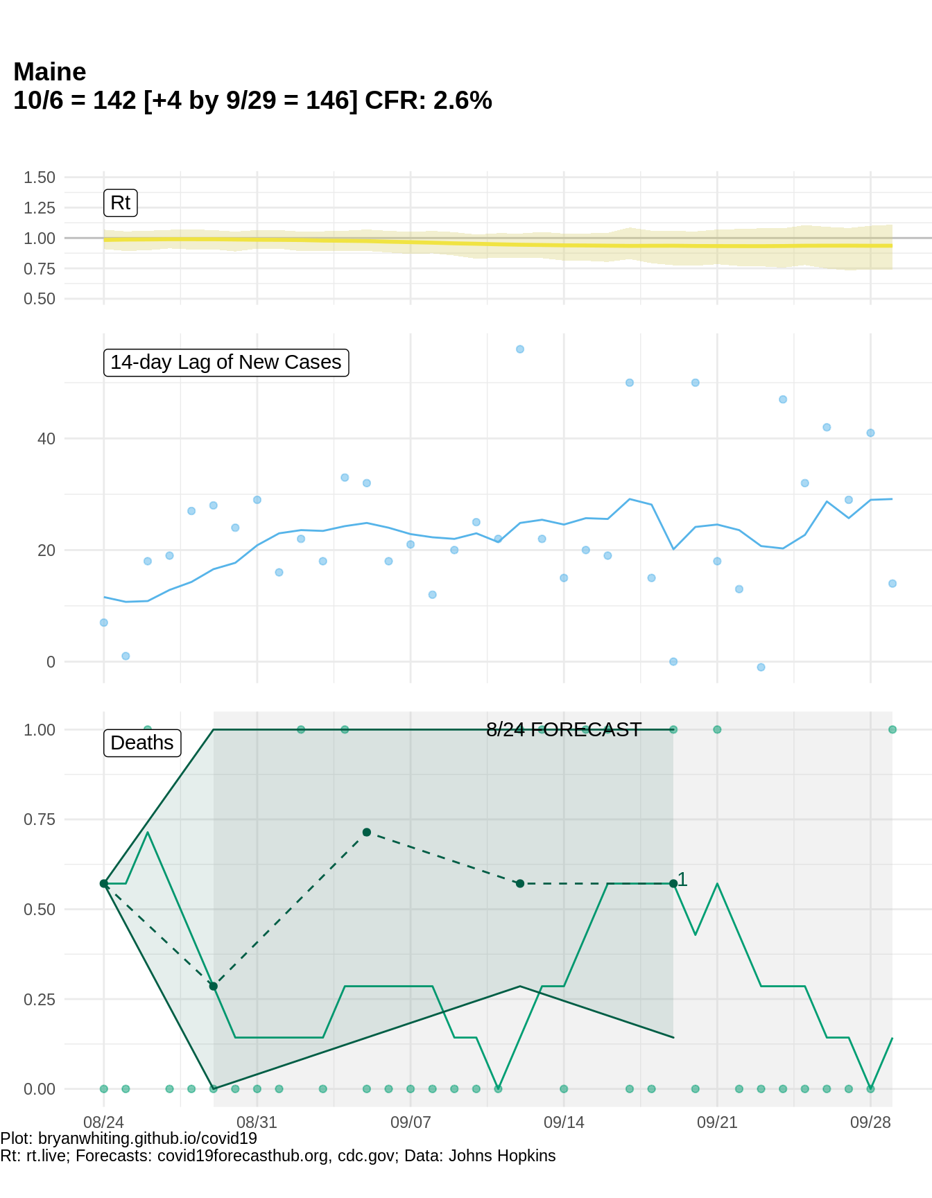
Maine
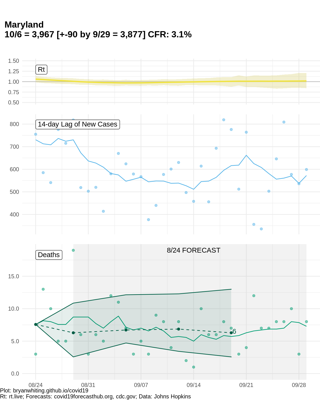
Maryland
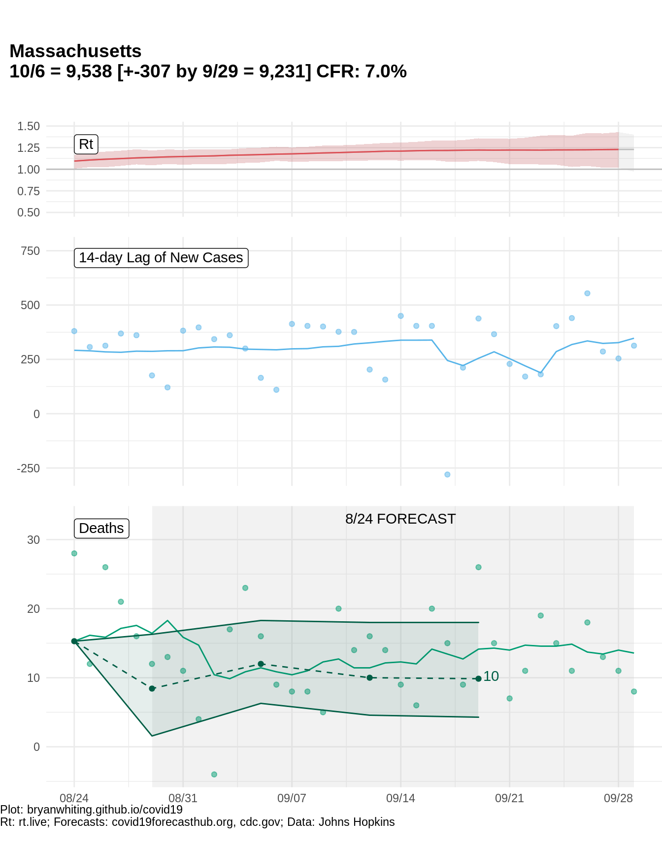
Massachusetts
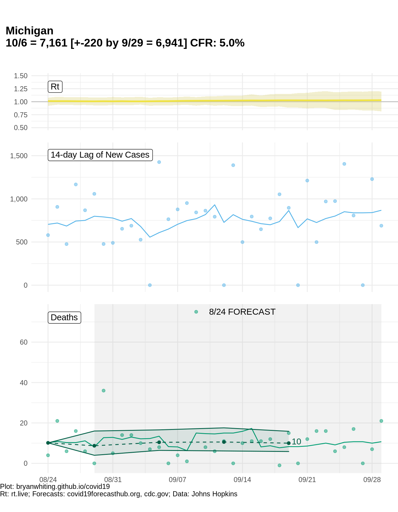
Michigan
Minnesota
Mississippi
Missouri
Montana
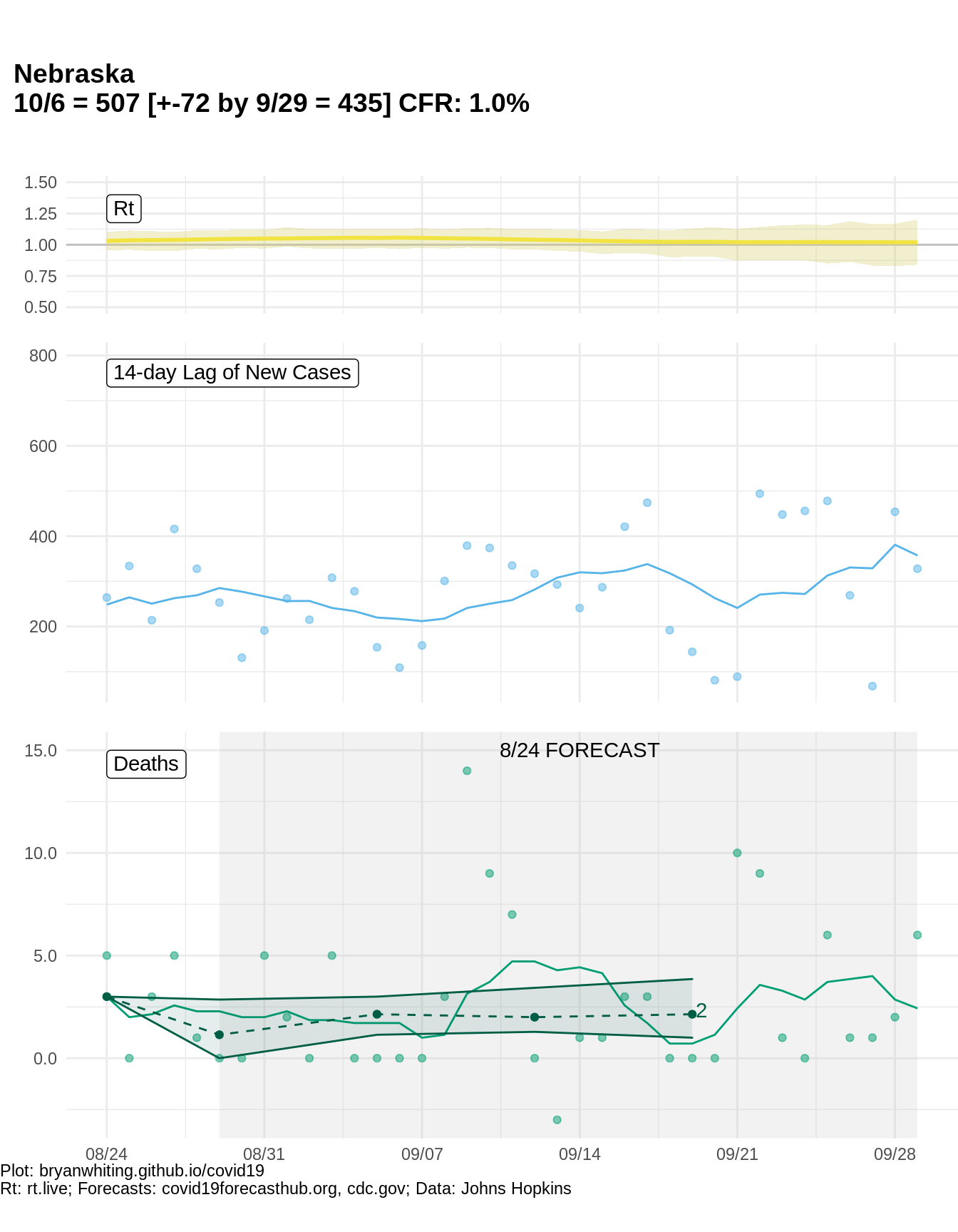
Nebraska
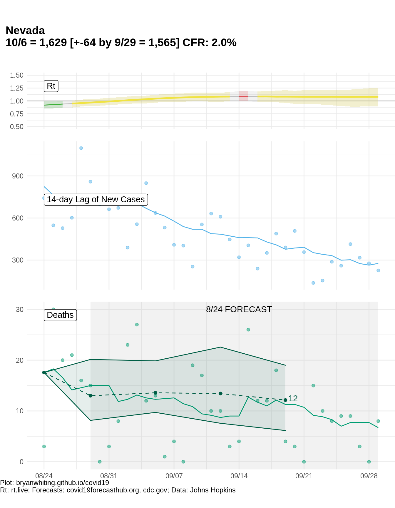
Nevada
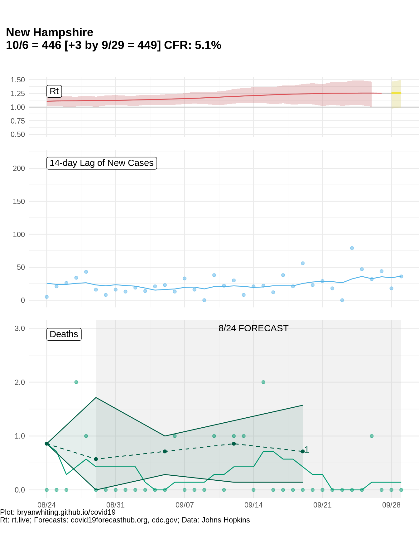
New Hampshire
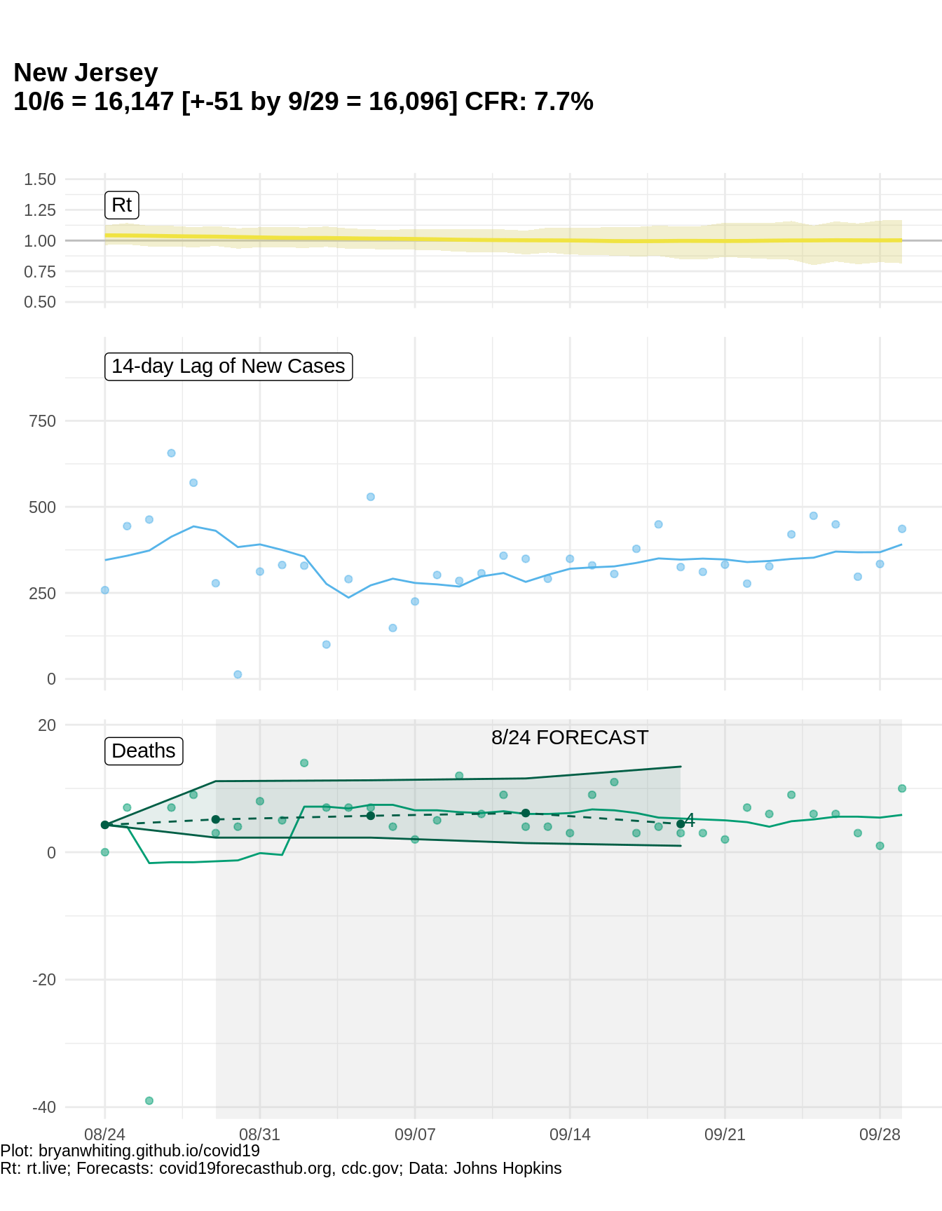
New Jersey
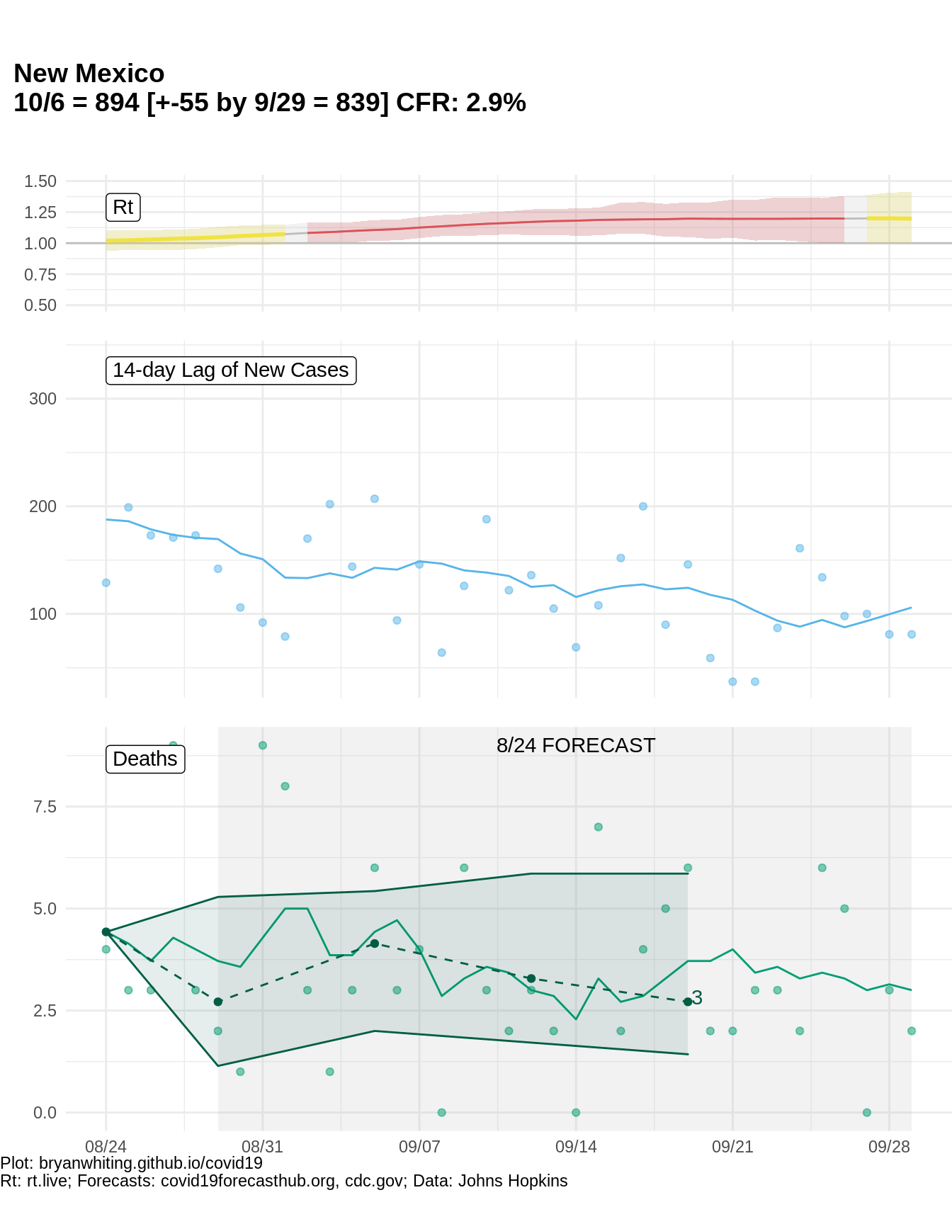
New Mexico
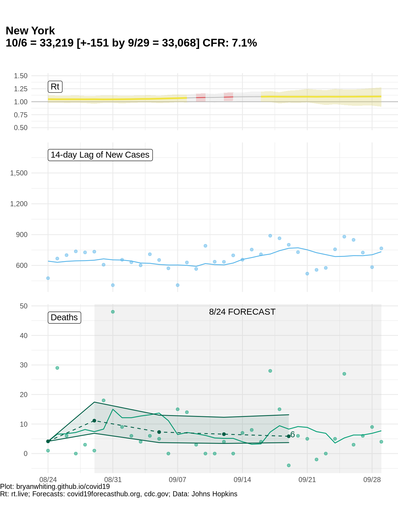
New York
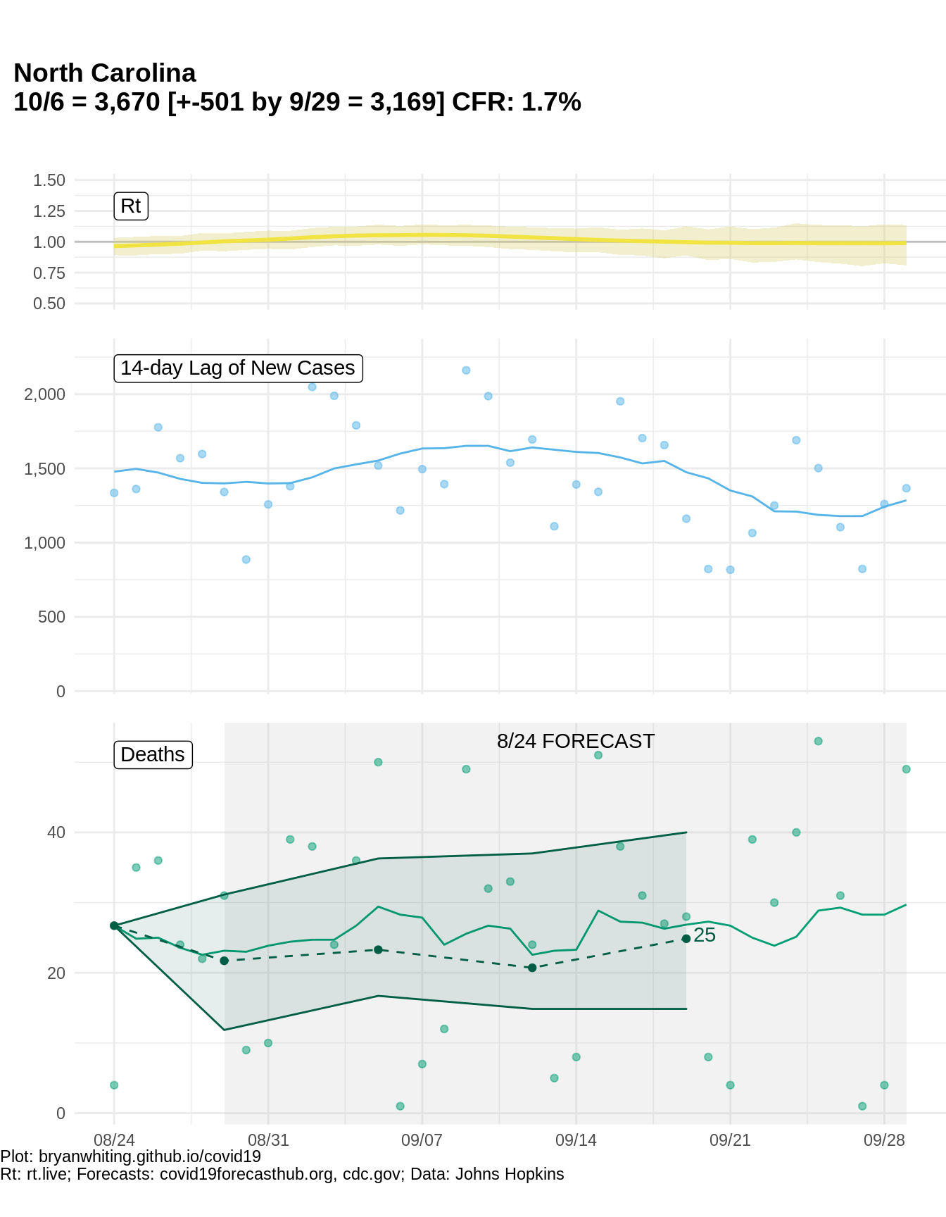
North Carolina
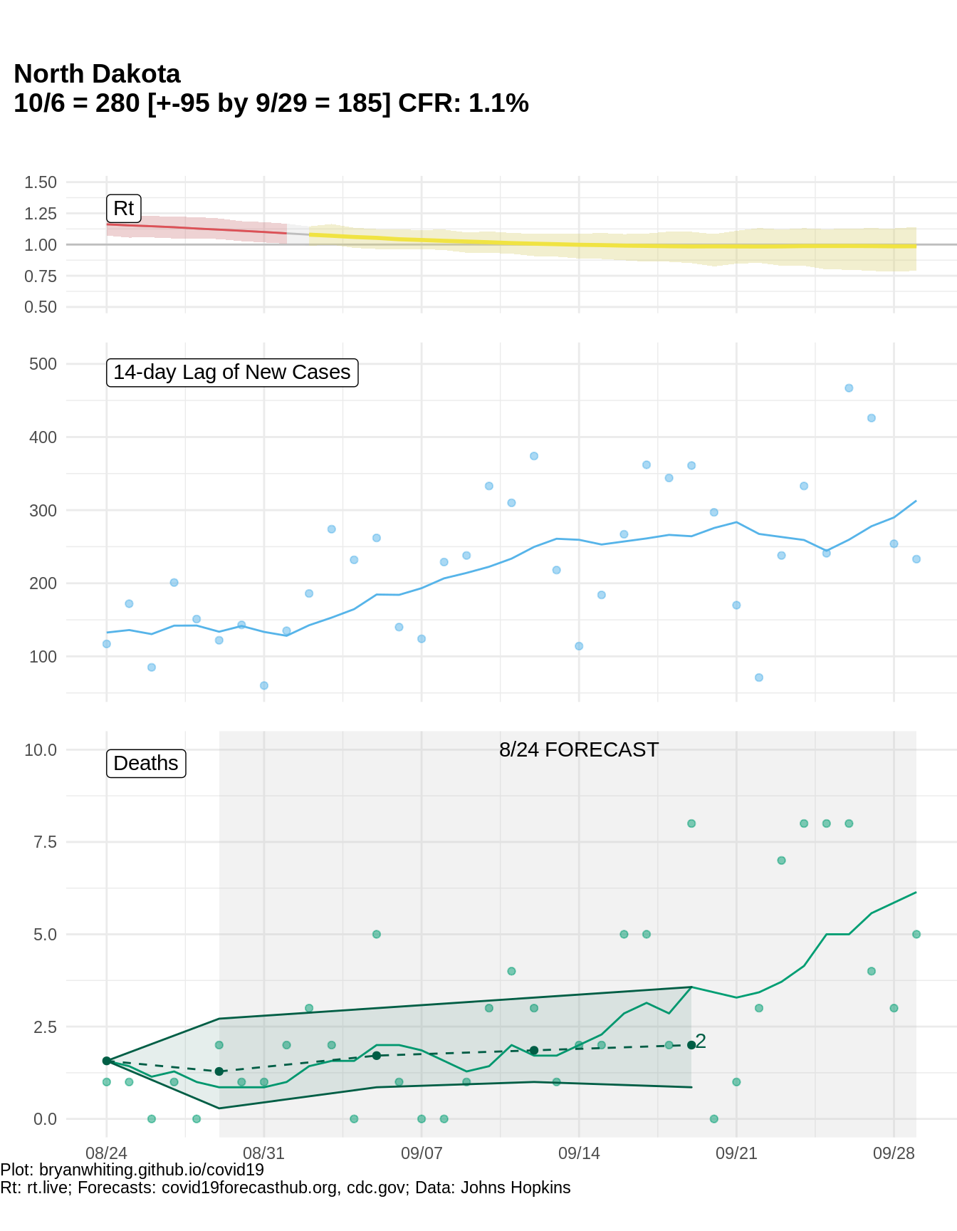
North Dakota
Ohio
Oklahoma
Oregon
Pennsylvania
Rhode Island
South Carolina
South Dakota
Tennessee
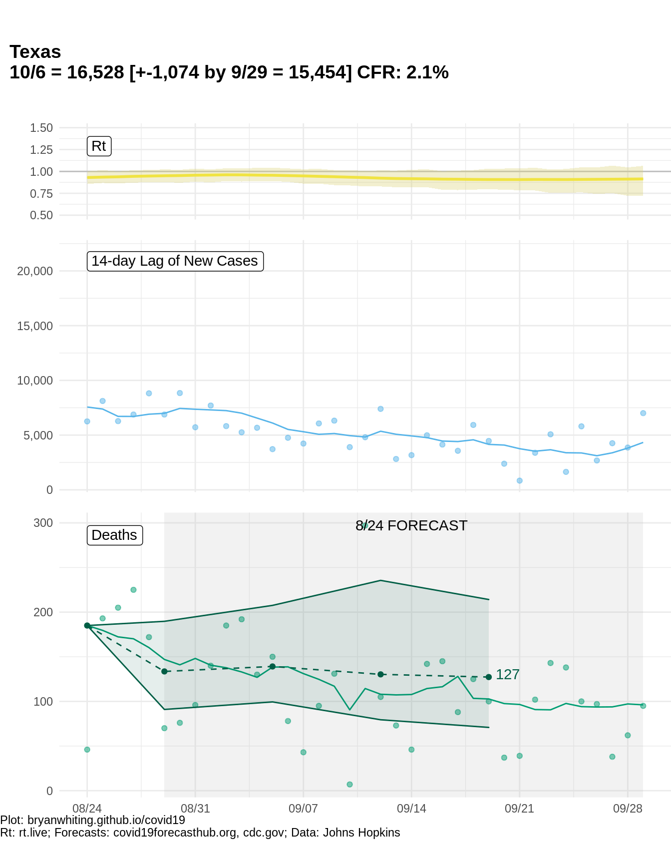
Texas
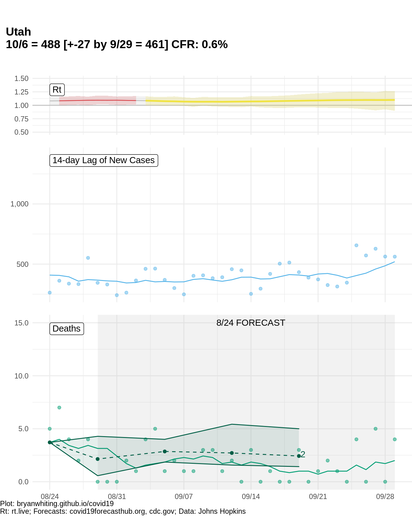
Utah
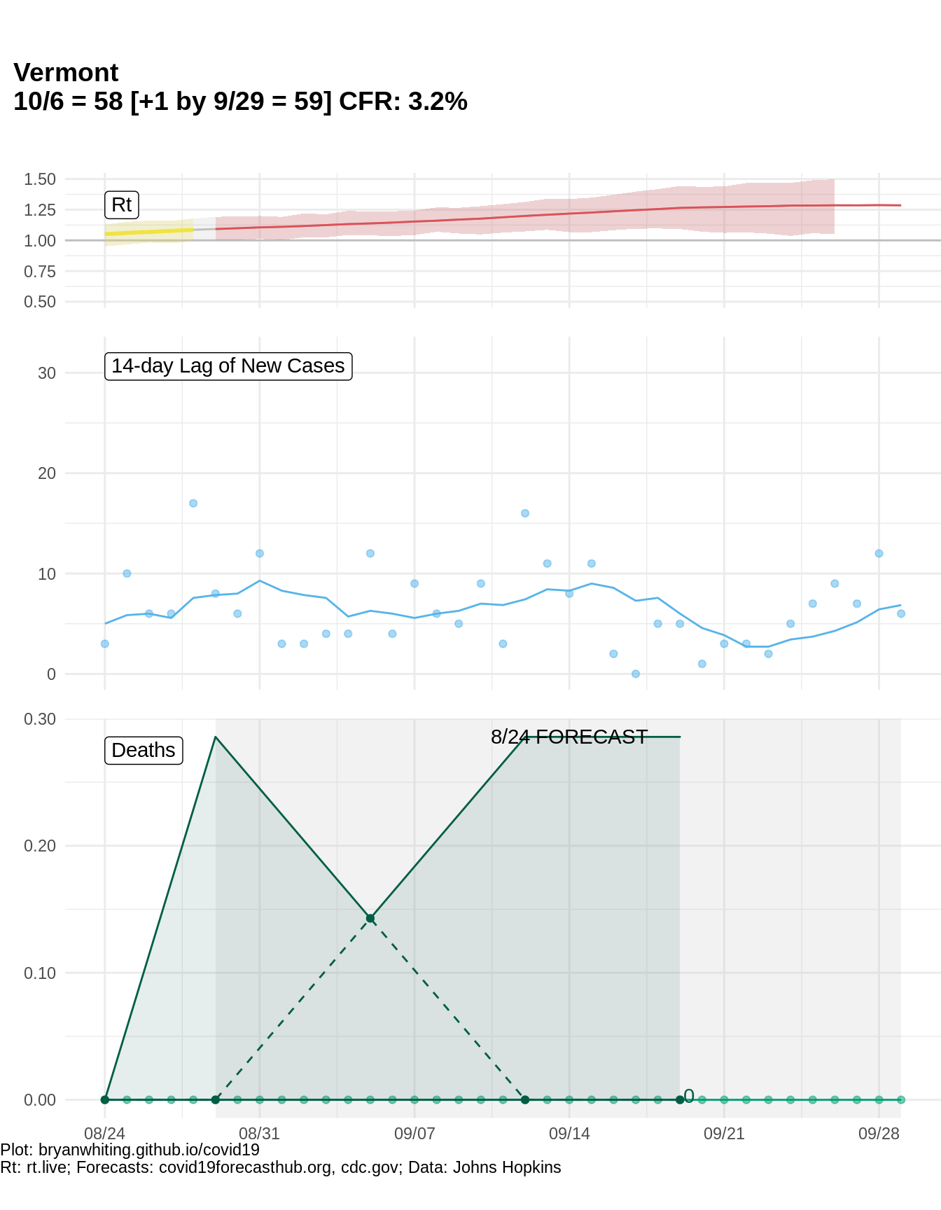
Vermont
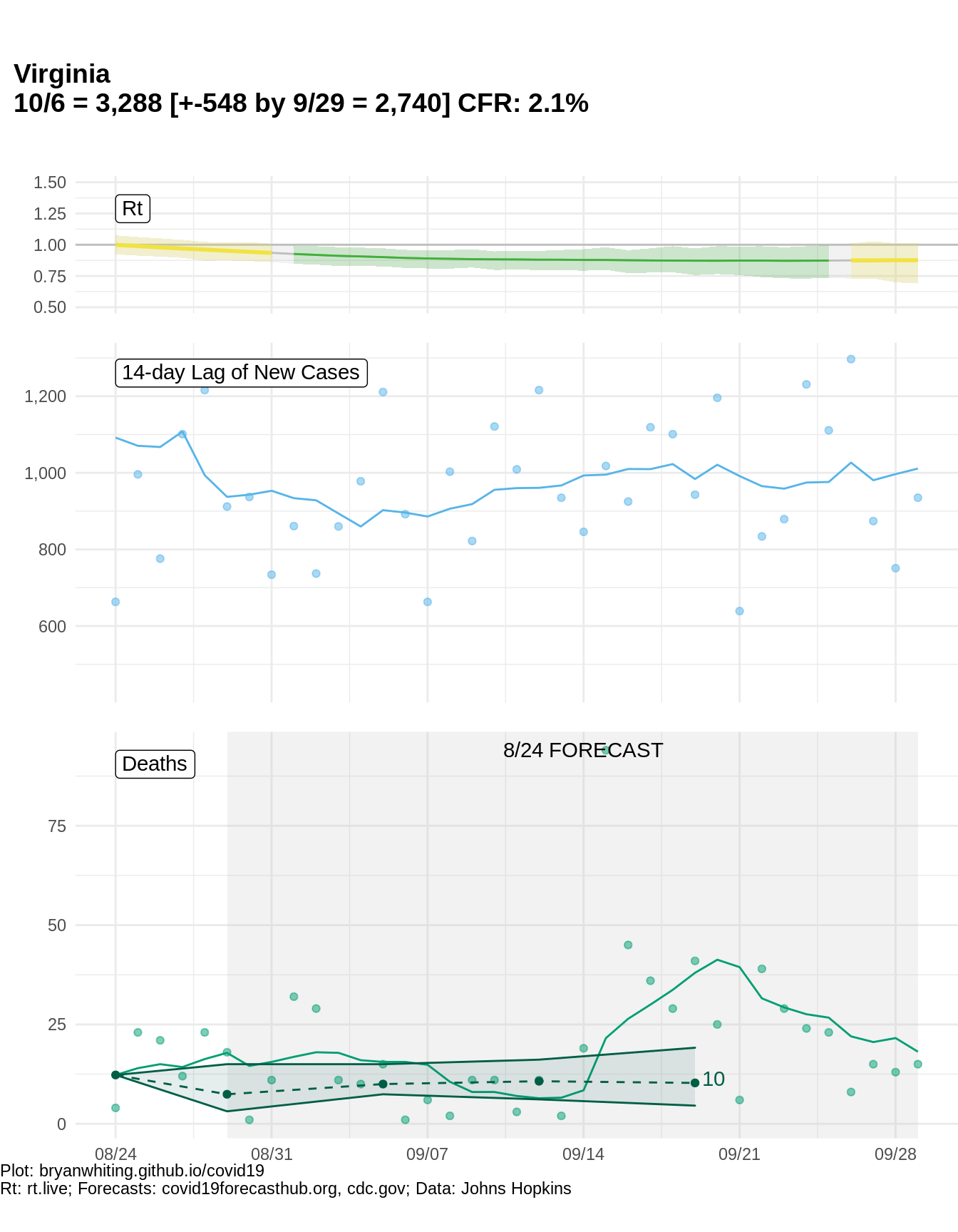
Virginia
Washington
West Virginia
Wisconsin
Wyoming